Designing a trans-affirming visual identity
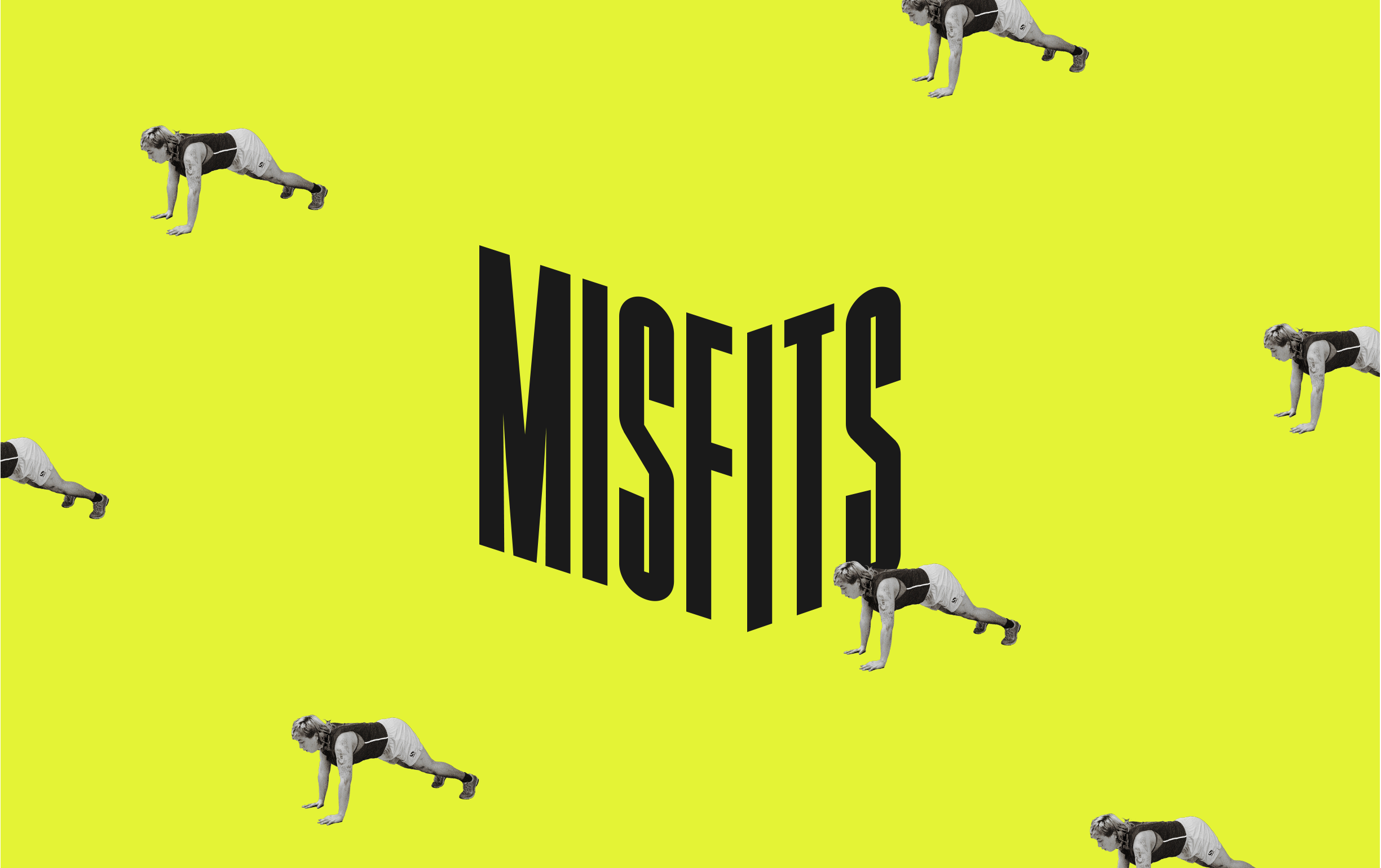
Image description: the Misfits logo in black against a green background. The lettering wraps around an invisible corner. Cutout photographs of a Misfits attendee working out are repeated as a pattern across the image.
Uplifting the lives of trans+ adults
Launched in 2020, Not A Phase is the only UK charity which focuses solely on supporting trans+ adults. Since then, it’s grown rapidly during a time when gender-diverse people have faced huge challenges socially, politically and economically, offering a wide range of support, from social events to funding for trans+ entrepreneurs.
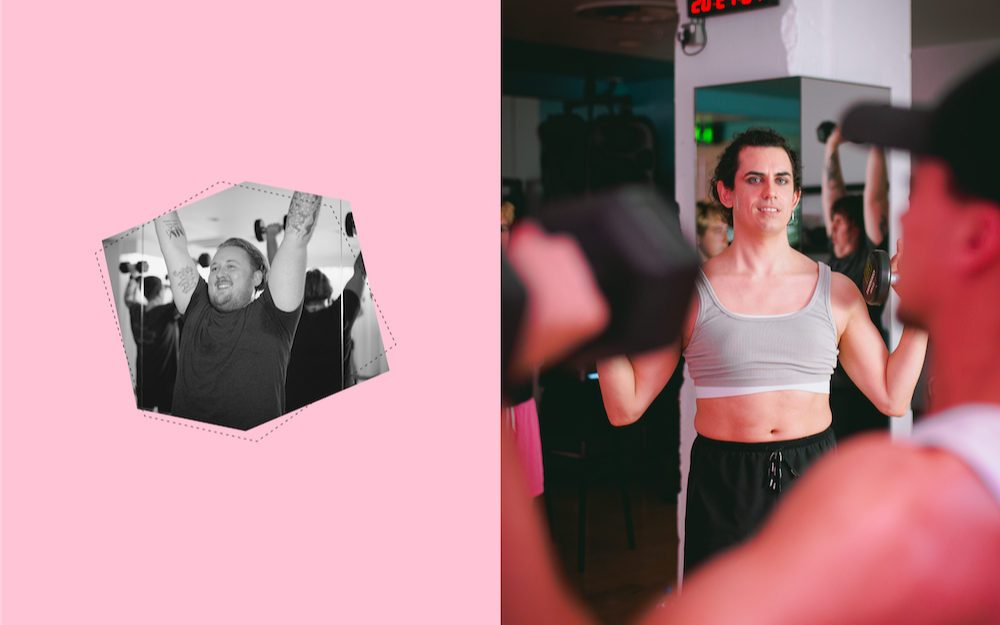
Image description: Two photos of Misfits attendees as shot by photographer Edi Whitehead. One is smiling with their arms outstretched holding two dumbbells. The other is wearing a grey sports crop top, also working out with dumbbells in a fitness class.
In early 2022 the team at Nike London approached us to design a new visual identity for Misfits, a fitness and self-defense programme and the charity’s most successful initiative to date. Misfits is more than just about working out – it began by taking the previously exclusionary space of the traditional gym and claiming it as a haven for trans bodies and minds, where the community could unite and build new connections through movement. From yoga, to weight-training, to archery, Misfits provides free-to-access opportunities for the trans community and opens up the doors to spaces that are all too often filled with obstacles to those that are trans+ or gender diverse.
A family, not a brand
We knew from the start that rebranding Misfits required an understanding of the charity’s wider scope. We met with people who had been supported by Not A Phase’s work and with key stakeholders, gathering their thoughts and feelings about both the programme and the organisation. What stood out was the word community – the more we spoke to people about Misfits, the more we heard that word.
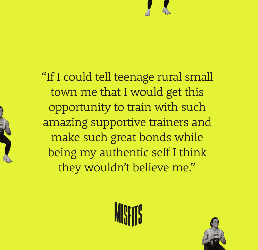
Image description: a quote from one of the Misfits: “If I could tell teenage rural small town me that I would get this opportunity to train with such amazing supportive trainers and make such great bonds while being my authentic self I think they wouldn’t believe me.”
We spent an evening at one of the sessions to see this for ourselves. One attendee told us how Misfits was proof that “gyms are not just a place for cis men”, and another shared that their previous experience of gyms had been as “dysphoric settings” – but not anymore. What we witnessed was a group of people claiming a space that was rightfully theirs.
Building out an idea, and a diverse team
Working with this theme of claiming space, and building on the the square characteristics of Not A Phase’s primary logo (which we were asked not to change), we landed on a core brand device composed of a logomark that wraps around a corner — our bold and friendly reminder for the trans+ community to take up that extra bit of space. With this guiding principle we brought in more creative voices to collaborate with – a mix of trans creatives and allies that we trusted to bring the wider identity to life.
To reinforce our unapologetically joyful tone, we wanted to show trans bodies in the most exuberant and honest light possible. There’s a notorious lack of this type of imagery available, so we commissioned Edi Whitehead to photograph the community and focus their lens on capturing trans+ joy and body euphoria.
Beyond photography we worked with type designer Johanna Lian Olsen, pairing her confident Duë typeface with Jan Fromm’s Rooney. In motion we created a language that allowed any word to take up space by wrapping around an invisible corner. And when it came to colour we didn’t want to hold back. We expanded Not A Phase’s existing palette of calm colours (taken from the trans pride flag) with a high energy green and purple, creating a spectrum of options that could each be matched to different levels of physical activity – from mindfulness to high intensity training.
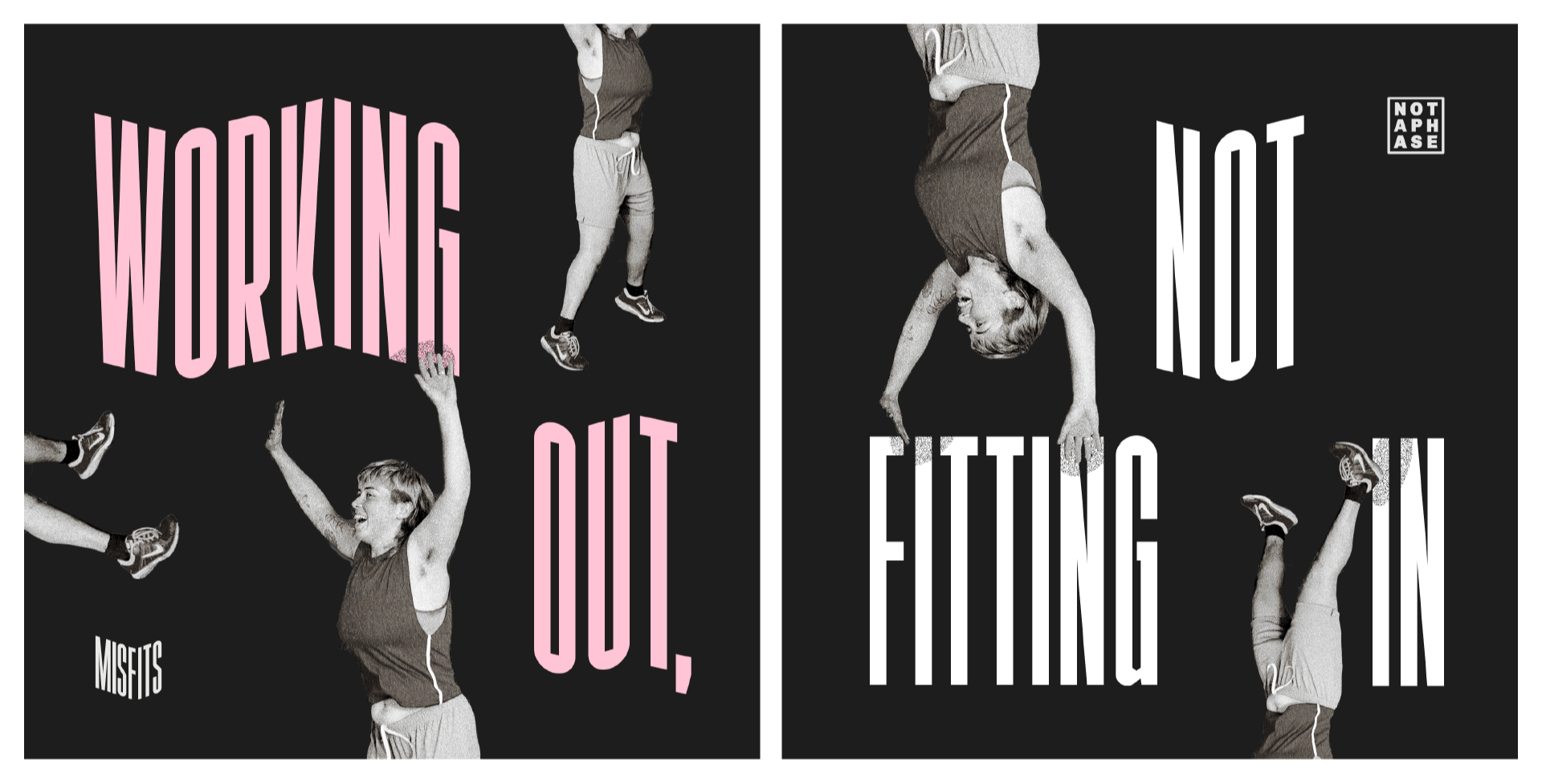
Image description: Two bold messages appear surrounded by a Misfits attendee jumping and smiling, some of the photography is rotated upside down. The words read “working out, not fitting in.”
Spreading our wings
After launching Misfits, Not A Phase asked us to think about how the wider Not A Phase brand could be evolved and applied to a new website. This larger remit meant thinking of multiple audiences beyond the Misfits community. We gathered insights from an expert with an understanding of corporate partnerships, the charity’s founders, as well as attendees of one of Not A Phase’s social events.
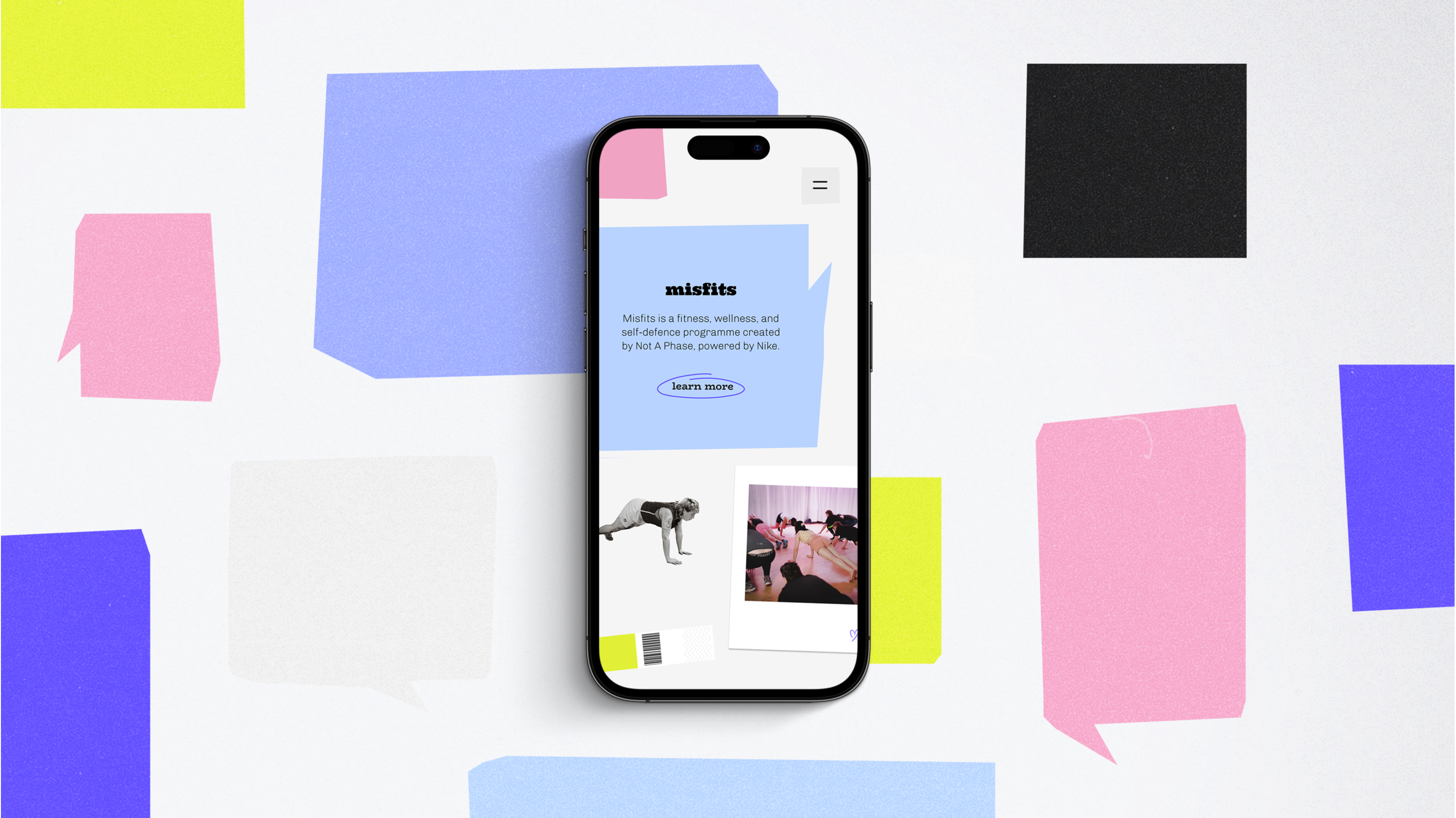
Image description: The Not A Phase website on a mobile device, showing the noticeboard-inspired identity. Different elements are arranged like notices on a bulletin board.
Working with our queer-owned web development partners, Studio Lutalica, our role was to design the new identity and site. By change, we stumbled upon a big idea on a fortuitous bus ride.
A community noticeboard
As the perfect visual metaphor for this function and structure, we found inspiration in the humble cornershop noticeboard of one of our local supermarkets: an unfussy community resource with a mismatch of styles and handwriting that summed up the inclusive and cheeky spirit of Not A Phase.
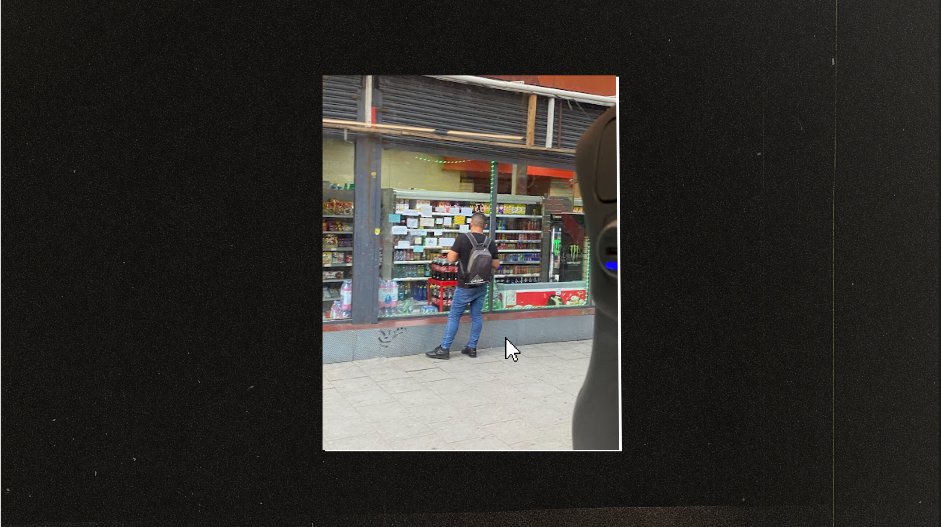
Image description: A man stands in front of a set of handwritten notes posted on the window of a noticeboard in South London, shot from a bus.
This idea was developed into a full identity with a brand new website at its heart. We found a way to ensure no distinction between what’s fun and functional, underpinned by a design language that can support the organisation as it matures, without forcing it to grow up. We pushed for accessibility too – ensuring leading best practices were met.
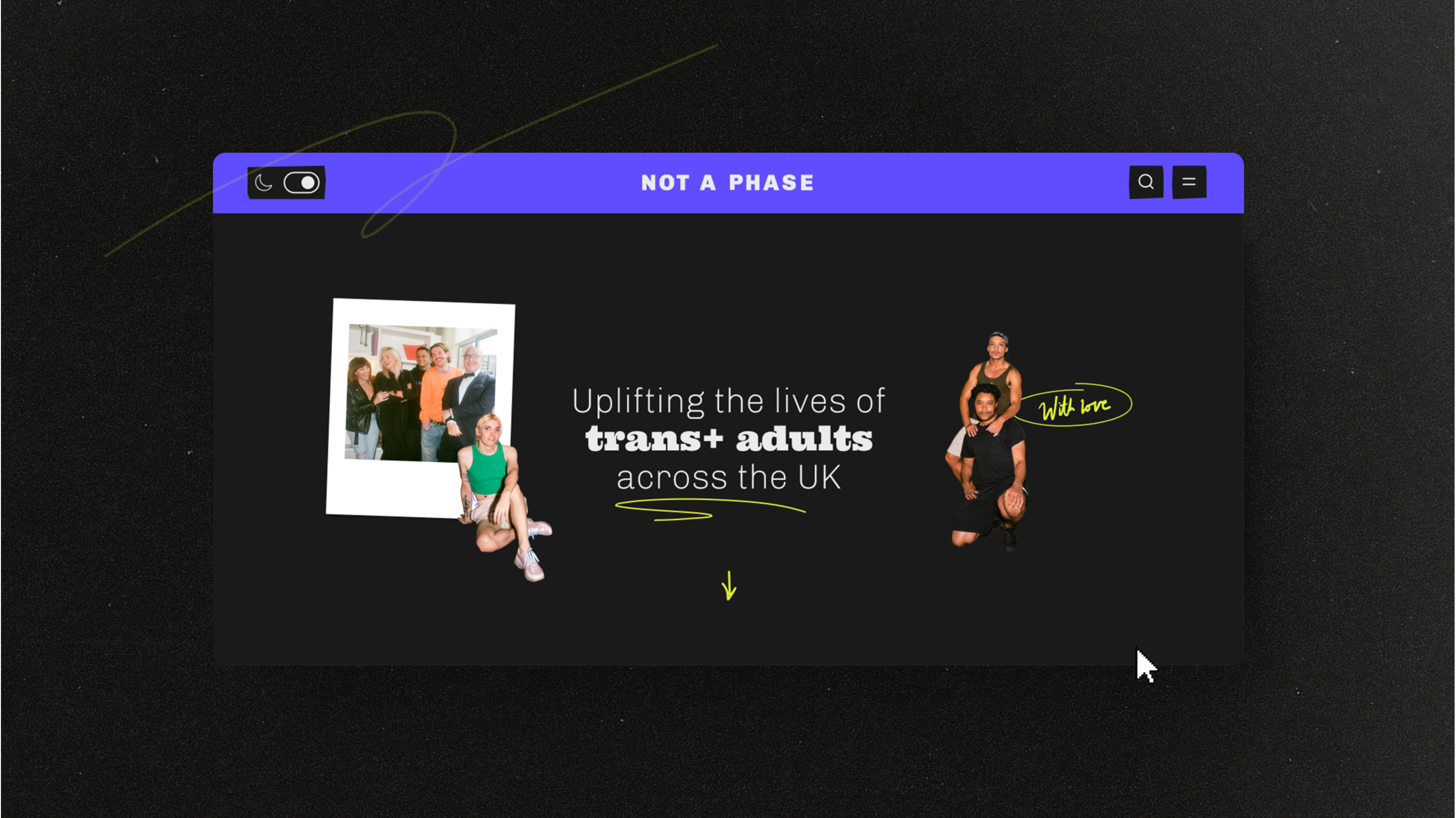
Image description: The Not A Phase website in dark mode, with photography of the trustees and other members of the charity’s community.
Alongside the new site we produced flexible content templates for the charity’s social channels, live events and corporate training, working with free-to-use design tools, empowering the charity to take control of their own brand once the project was complete.
Share
Designing a trans-affirming visual identity
Against the backdrop of a hostile political and news agenda, we worked with trans+ charity Not A Phase, their corporate partner Nike, and the community, to co-create a visual identity designed to showcase trans joy.