Trend

A move to the minimal

Liam McHugh, Design Director at Missouri Creative writes that brand logos are being simplified because the world around them is more complex.

Liam McHugh

Design Director Missouri Creative

Share


A mass of brands are taking a more minimal approach to their logos, which to ‘the everyday man on the street’ may seem a lazy attempt at ‘being cool’. Before we can begin to make judgement on these logos, we need to look back to unpick where we are today.

Throughout the 1950s and 60s, there was a shift in the way that designers thought about logos. As companies realised just how impactful symbols could be, they began to move away from simply using or creating attractive script or decorative typefaces. A prime example is Pepsi’s shift from a script typeface to bold sans serif. They flattened their logo, dropped the word ‘Cola’ all together, and moved away from the scriptive red font they’d been using for the past 64 years. Pepsi’s aim was to communicate that they were a brand ‘for those who think young’. Simultaneously, they were implying that their rival, Coca-Cola, was an old, stuffy brand disconnected from youth culture.

In 1961, Paul Rand designed the iconic UPS logo. It was a simplification of the existing logo, keeping the familiar shield but adding an iconic symbol of a parcel to express the company’s speciality of delivering packages. Designers were starting to realise that logos were not just for commercial purposes but could be used to create a deeper connection with the consumer, subtly communicating brand purpose and value.

Logos are being simplified because the world around it is more complex.

Liam McHugh

A new digital era

The development of computer-generated imagery (CGI) and computer-aided drawing (CAD) technologies completely transformed how the world consumed design. In the 1980s, MTV took their static logo and made it radical, creating a digital design that could constantly evolve. The logo was animated through colour, form, patterns and textures, which showed the world how a brand could be alternative and edgy through just its brand mark. Before digital screens, this manipulation of a logo wouldn’t have been possible, unless you made an extremely long flick book.

Following CGI and CAD advancements, the 1990s brought an influx of home computers from brands such as Dell, IBM and Apple, and in the early 2000s, Adobe developed packages such as InDesign and Photoshop. Combining all this tech brought branding and design into people’s homes and signified the start of a new digital era.

What did this mean for logo design?

Responsive design

In the early days of the internet, logos presented themselves in gradients, drop shadows, faux textures and metallic horizons; WWF logo as a childhood standout, not the panda one. As the world became more comfortable and competent with digital technologies, it was no longer necessary to over-indulge in all the snazzy effects.

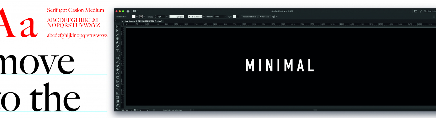
Stripped back or minimal logos achieve a crisper, cleaner, more modern feel. One of the world’s most ubiquitous brands is Google. Since 1997, Google has slowly stripped back the effects and visual noise surrounding their logo, modifying it seven times between 1997 and 2015; most likely due another update soon. A myriad of Silicon Valley start-ups such as Airbnb, Pinterest, Spotify have also followed suit, decluttering their logos and optimising them for a digital age.

According to the app RescueTime, we spend a staggering three hours and 15 minutes a day on our phones; that’s a lot of content to consume. Logos are displayed as small as 2cm by 2cm on the screen of your phone and may only be seen for a split second; anything that is too detailed or fussy will be missed. Logos can no longer be static, but instead require a ‘responsive’ design that can work across multiple digital channels.

The brand mark needs to have fluency to thrive in a world where digital is king.

Liam McHugh

Much more than a logo

Today brand logos are dictated by technological limitations, the size of a button within an app or how it is seen within the digital world. Even though the brand logo is key, the digital world can be so vibrant, animated and flowing in many formats that is may become overpowering. The logo needs to be simple, clean and bold to have a chance of cutting through. The days of a logo living for 10-20+ years are nearly unheard of.

Brands have had to take a step forward to remain relevant, and to do this, they need to regularly update their logos to conform to this new digital landscape. Luxury brands such as Balmain, Burberry, Balenciaga and Yves Saint Laurent drop decades of heritage in favour of minimal designs to accommodate for technological advancements. Designs can no longer be a logo above a beautiful Neoclassical architectural doorway. The brand mark needs to have fluency to thrive in a world where digital is king.

Logos are being simplified because the world around it is more complex. Often the first interaction with the brand will be on social media, on banner ads and immersive website or platforms such as TikTok, Instagram or Youtube. Therefore, brands need to be creative and a minimal logo allows for the freedom to build a multi-channel Brand World that can break boundaries and stretch creativity. Brands are now much more than their logos, and the Brand Worlds around the mark can be much richer than the logos itself.

Guest Author

Liam McHugh

Design Director Missouri Creative

About

Working in numerous top London design agencies, Liam has worked across many disciplines including packaging, print, retail, branding and art direction. He has worked on some of the world’s leading brands including from Adidas, Asics and Nike, to Coca-Cola, Kronenbourg, Hennessy, Jameson, Havana Club and G.H. Mumm. Liam’s role within the Missouri studio is to support, inspire and lead the design team over projects from ideation through to implementation.