BITE Focus

The power of print

While there is no question that print publications have been and still are struggling, the medium has still not lost its power to delight, shock and engage. What we are seeing is print finding a new relevance in a digital-first world.

Izzy Ashton

Deputy Editor, BITE Creativebrief

Share


Absolut 'Kiss with Pride' by BBH London

“Nobody reads ads. People read what interests them and sometimes it’s an ad.” These words came from the Mad Men-era ad man Howard Gossage and to this day perfectly capture the challenge faced by every marketer when creating a print ad.

While there is no question that print publications have been and still are struggling, the medium has still not lost its power to delight, shock and engage. What we are seeing is print finding a new relevance in a digital-first world.

Interestingly, a recent study conducted by Kindle revealed that people remember words better when they read them on paper. Readers on a Kindle were distinctly worse at recalling the plot of a book when compared with those reading physical pages. This is a powerful piece of insight for a brand when choosing where to place its marketing message.

The tangibility of holding words in your hand seems to amplify the sense of trust that an audience gets from printed material. The permanence of print serves to highlight the conviction of message behind it.

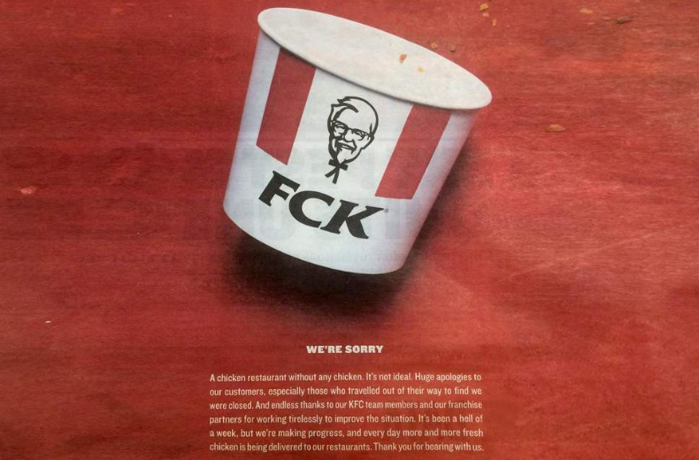
Print is often considered to be one of the most trustworthy forms of advertising, as seen in a survey conducted by MarketingSherpa. Just look at the number of brands that have turned to it to apologise. Earlier this year, Mark Zuckerberg chose print to say sorry for stealing people’s digital information while KFC used it to offer an apology for their chicken shortage.

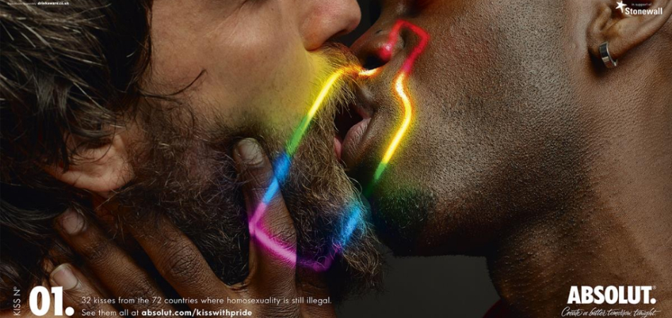
In the past year, we have seen many brilliant print ads including Absolut and BBH London’s Kiss with Pride and DAVID Miami’s Don Draper-inspired Pass the Heinz, showing us that print as a medium should not be underestimated.

Getty Images 'The Worst Photo' by DDB Argentina

Provocation

It can be difficult to shock a seemingly un-shockable public. Our news is littered with stories too horrendous to repeat, and fact and fiction fight for the biggest headlines. As such, it is hard to surprise a disbelieving, cynical audience who feel they have seen it all before.

For the launch of the second series of the Handmaid’s Tale, Channel 4’s in-house team 4Creative designed a provocative campaign to shock London’s commuters. Along with an interactive billboard in Waterloo station, the team created wraps on the front of the Metro newspaper that read “Women are not allowed to read this newspaper”. The sentiment was bold and offered no explanation, unless you turned to the inside cover on which Elizabeth Moss’s character Offred was revealed, burning her handmaid’s headdress.

DDB Argentina worked with Getty Images on their campaign The Worst Photos to highlight the reality that sometimes, the images we deem to be skilfully great can be brought into stark contrast with their subject matter. Among some of the photos included in the campaign are a child with a rifle thrown over its soldier, a rhino whose horn has been hacked off and a man standing atop a stinking pile of rubbish, all under the tagline, “gettyimages: the best and the worst photos”. The horror of the subject matter is placed at odds with the beauty of the artistry.

The New York Times 'The Truth Has a Voice' by Droga5 New York

Powerful message, simple graphic

It was Leonardo Da Vinci who said “simplicity is the ultimate sophistication”. Because sometimes, less is really more. The most memorable print ads use bold and simple language to make their point. The campaign message is clear, not hidden beneath nuance or reliant on the audience’s guesswork.

Often ads that address the dangers of texting when driving depict horrific accidents, bereaved families or the graphic events themselves. Whilst these are no doubt effective, for Gitam BBDO’s latest work with Opel, SMS Mistype, they decided to keep things simple. On a plain black background sits a white box, a text message misspelled to point out the obvious, that your typing when you drive is as bad as your driving when you type.

For International Women’s Day, The New York Times worked with Droga5 New York to create The Truth Has a Voice, a progression of their ongoing campaign The Truth is Hard. The newspaper played a huge role in bringing sexual harassment to the fore with its coverage of the Harvey Weinstein case, amongst other stories. The emphasis for this campaign was on overlooked women, on the journalism as the hero of the story. Black and white portraits of some of the newspaper’s journalists sit beneath storytelling headlines that have come directly from their published pieces.

KFC 'We're sorry' by Mother London

Apologise, for real

Sometimes, if you’ll allow me Elton, sorry really does seem to be the hardest word. But over the last year, we have seen several major brands turn to print to offer a heartfelt apology to the masses.

In the wake of the privacy breach on its platform, Facebook took out full page print ads in national newspapers across the UK and US. Signed by Mark Zuckerberg, the simplistic ads decreed that “We have a responsibility to protect your information. If we can’t, we don’t deserve it.” The online platform had lost the trust of its users so resorted to the traditional medium of print to add gravitas to the apology.

When a chicken shop reveals it’s all out of chicken, you’d assume that might be the end of them. But, when its new logistical partner DHL failed to supply the fresh poultry they needed, KFC worked with Mother London to execute crisis management. In response to a national KFC chicken shortage, they took out print ads in The Sun and Metro. The brand logo on a bucket was rearranged to read FCK, while the bucket sat on a red background with just a few ghosts of chicken wings past imprinted. The apology below, which maintained the brand’s dry, pithy, blunt tone, thanked loyal customers and staff, beginning by saying “A chicken restaurant without any chicken. It’s not ideal”.

IKEA 'SÖMNIG' by Memac Ogilvy

Make it interactive

Multi-sensory experiences help us to remember things better, as research conducted by the UNIL at the Lausanne Hospital University in Switzerland has shown. The simple reality is that you get and can take in more information when you use more than one of your senses.

IKEA’s latest ad in the UAE, SÖMNIG, created by Memac Ogilvy, is designed replicate the sleep-inducing power of an IKEA mattress. Initial research from the brand revealed that nine in ten people in the UAE were not getting the required eight hours of sleep a night. The print ad pops out to create a helpful sleep assistant complete with lavender-infused ink, lavender scent and audible white noise, proven to aid sleep.

Kia’s Stinger Book, created with Innocean, allows you to scratch and sniff the smell of burning rubber. The interactive promo booklet was sent to 100 automotive journalists to launch the latest Stinger model. The brand created eight levels of interaction to capture the thrill of driving the car, through sensory experiences on each page. A sticker revealed the first image of the car while the book also encouraged people to use their finger to spin donuts on the page, which then folded out to reveal the track marks on the micro-fibre cloth underneath. The book was so successful that Kia ordered 2,000 more to send to owners, dealers and VIPs.

Burger King 'Burning Stores' by DAVID Miami

A picture is worth a thousand words

Unlike TV and digital media, in print you have nothing to fall back on. No dramatic score underpinning the intense animation, no explanatory conversation to unpack a difficult-to-sell concept. You simply have the words on the page or, often more powerfully, one static image.

BBDO Bangkok worked with AirAsia on the latest installation of its Weekdays campaign. Designed to encourage people to travel midweek rather than at the notoriously busier weekends, their latest ads depict a whole lot of noise around the edges of a scene, while a happy, holidaying couple in the centre relax in blissful solitude. From a huge hotel to neatly lined beach umbrellas and a garden restaurant, the images perfectly convey the campaign’s message.

Sometimes the bravest, craziest ideas can create the most powerful images. Burger King’s campaign with DAVID Miami, Burning Stores, was audaciously brilliant creativity at its very best. They used photographs of actual Burger King stores around the US, at the precise moment they were going up in flames. Their infamous tagline, which in this case provided the perfect double-entendre, read “Flame grilled since 1954”.


Related Tags

Print Purpose

Agencies Featured