Trend

Visual Impact

Changing perception through brand design

Kara Melchers

Managing Editor, BITE Creativebrief

Share


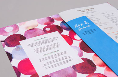
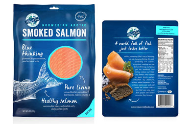
We’re a nation obsessed with food, who have grown up to become a nation obsessed with ingredients. Lurpak were a brand who recognised this and transformed themselves from just another fat, into the ingredient for adventurous chefs. As we become more conscious about where our food comes from many products have sought to revamp their visual identity and packaging to combat negative perceptions and give them a fresher look.

Scarred by crisis and corruption, banks and other financial institutions have used brand design, tonality and language as weapons to rebuild customer trust. Following their split from TSB, Lloyds worked with Rufus Leonard to reposition themselves as a bank with real heritage. This resulted in an entire refresh of their brand, including a new logo, typeface and clarity on colours. The new identity was adapted across all touchpoints including bank fascias and in-store literature. The rebrand was a key factor in the £1bn turn-around.

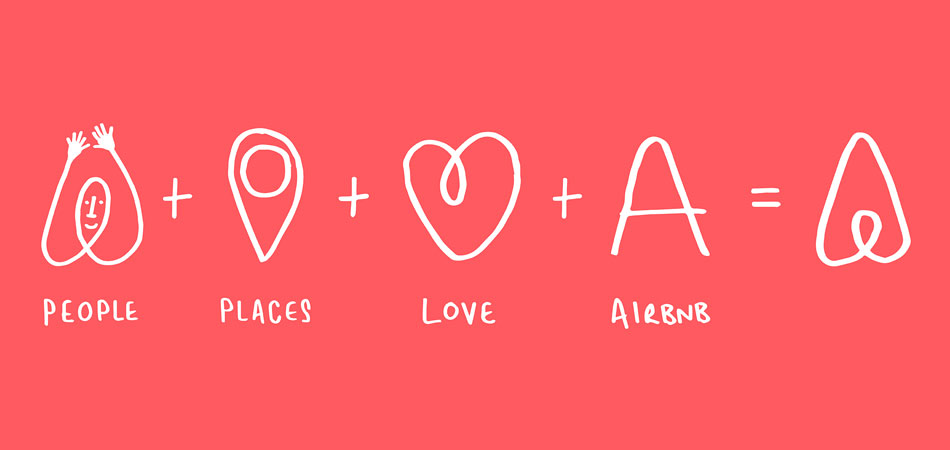
Companies growing out of the new digital economy have used visual identity to reflect their values and lure customers away from established brands. Airbnb used their new identity to help build confidence in its service and appeal to new audiences. A special website encourages users to play with the design of the ‘Bélo’ logo, reinforcing the collaborative nature of the brand and it’s Belong Anywhere ethos. New technological discoveries and cultural trends mean brands are forever evolving their products and services.

As we see more branding agencies being retained by clients, visual identity will become a gradual evolutionary process, whilst still regaining a clear sense of identity.

Read on for examples…

Mccain Takes It Back To The Farm

McCain, the world’s leading frozen chip brand, faced the challenge of changing negative consumer perception due to its associations with unhealthy food. Combined with an ambitious 53% growth target, design was seen as an integral way to achieving this goal. The previous McCain identity had been unchanged for 50 years. A global shift in attitudes and issues around unhealthy foods meant McCain was increasingly tarnished with a negative consumer perception.

The challenge was to infuse the brand with new meaning and move conversation towards the natural ingredients in order to drive reappraisal of McCain. Sunshine was established as the new symbol, reflecting positive associations of the natural world, warmth and happiness.

The redesign, featuring an identity with rolling landscape, birds and trees, covered products in 25 markets and communicated the sense that McCain ingredients are absolutely natural. The new identity created impact in stores and also helped McCain to refresh its range targeted at adults.

Agency: BrandOpus

9.6%
increase in sales
£17.7m
increase in sales

All Bar One Embarks On A Voyage Of Discovery

All Bar One needed to revitalise the brand and change people’s view of the generic food and drink chain in order to compete with new, more exciting, competitor concepts popping up. A host of imitators meant the brand had lost its identity and needed to add some fresh emotion and meaning to its offer. Collaborating with illustrators and becoming more adventurous with language resulted in the new identity, Discover Together.

The design positions All Bar One as a plac e to unearth new food and drink ideas in a comfortable friendly environment.

Agency: Ragged Edge

Blue Circle Challenges Fish Farming Perceptions

The new identity built meaning into the Blue Circle brand with a fresh new logo and a natural, integrated design that simplified the product story and helped consumers have a better understand of sustainable fish farming. This involved shifting perception away from negative connotations, helping people to focus instead on the quality of the product, while also communicating that fish farming supports a sustainable future for the industry. This innovative approach helped to differentiate the packaging and make it stand out from competitors on shelf.

Agency: Safari Sundays, New York

Mcdonald’s Packaging Tells Their Side Of The Story

Throughout the business McDonald’s is evolving to meet customers’ needs and respond to health concerns. Unfortunately the brand doesn’t always get credit for all that it’s doing. Every day their packaging passes through the hands of 70 million customers, providing the perfect platform to tell their story and celebrate all that’s good about McDonald’s. A new design framework uses storytelling and visual messages to communicate the new brand values.

Agency: Boxer

Related Tags

disruption Transparency