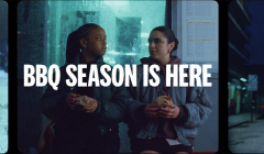
KFC prepares for British BBQ weather
The summer campaign for KFC’s Ultimate BBQ Burger readies Britain for rainy BBQs
The Guardian

Though it has shrunk in size, The Guardian won’t shirk from big ideas.
Disciplines: Integrated marketing
Sector: Media & Entertainment
Agency: Space, Karmarama
Though it has shrunk in size, the Guardian won’t shirk from big ideas. This is the message behind Space, the ad campaign created by Karmarama to promote the Guardian newspaper’s brand-wide redesign and the launch of the new tabloid format.
A white square covering the central part of the images on screen was used to symbolise space and is a design that seems heavily influenced by David Bowie’s 2013 album cover for The Next Day. Space is a key word when it comes to looking at what the Guardian focuses on, from environmental responsibility, to diversity and politics. The new Guardian has space for hope, for new voices and for responsibility.
The white space in the centre of particularly poignant images, from the President in the White House to plastic floating in the ocean and a homeless person on the streets. The white, newspaper-sized shape is symbolic of the new design that gives the paper the Space to discuss the ideas, problems and people that matter. The ad reflects on the renewed purpose of the Guardian and on its role in greater, societal debate.
The loss of the Guardian’s signature blue and white masthead and its Berliner format sees the newspaper align, aesthetically, with the likes of the Evening Standard and lose its distinctiveness on the newspaper stand. The rebrand, and accompanying campaign however, look to the future of press freedom, encouraging journalists and readers to view uncertainty as opportunity and to create space for debate and for change.
Looks like you need to create a Creativebrief account to perform this action.
Create account Sign inLooks like you need to create a Creativebrief account to perform this action.
Create account Sign in