BITE’s most-loved inclusive campaigns
To celebrate National Inclusion Week industry experts share their favourite inclusive work

Georgie Moreton
Deputy Editor, BITE CreativebriefIt is no secret that there is still a long way to go in bridging the gaps within representation in advertising. Getty Images research points to the fact that 20-25% of the world's population has some kind of disability but this is represented in just 1% of visual imagery, while MullenLowe Group UK’s Invisible Powerhouse research shows that 47% of UK adults are in their 50s and above (24.6 million), while only 12% of UK adverts currently feature someone over 50 in a leading role.
When audiences are stereotyped and ignored, businesses are failing to connect with valuable audiences, individuals are being negatively impacted and creativity is being stifled.
We need only look as far as Cannes Lions to see that inclusion is a key ingredient to success. As Creative Equals CEO and Founder Ali Hanan explained: “It is clear that diversity and inclusion is a driver of creative excellence.” So it's no surprise that some of the most memorable, impactful campaigns are the ones with inclusion at the heart.
When advertising is able to truly engage with communities, reflect lived experiences and help move forward the needle on inclusion, it has the ability to impact culture and wider society for the better.
While there is still a way to go before the industry is truly reflective of society at large, to celebrate National Inclusion Week, we asked industry leaders to name their most-loved inclusive campaigns. As well as considering the positive impact the industry can have and how to move toward a more inclusive, impactful future.
Jamie June Hill
Creative Inclusivity Director
VMLY&R CommerceInclusive ads have come a long way, from Bud Light’s 1993 “Ladies night” to 2023’s response to Dylan Mulvaney. So, when asked to a pick one campaign, recent favourites like “Ridiculous Reasons not to be Inclusive”, or Stonewalls “It’s Not Therapy, It’s Abuse” could have easily been my pick.
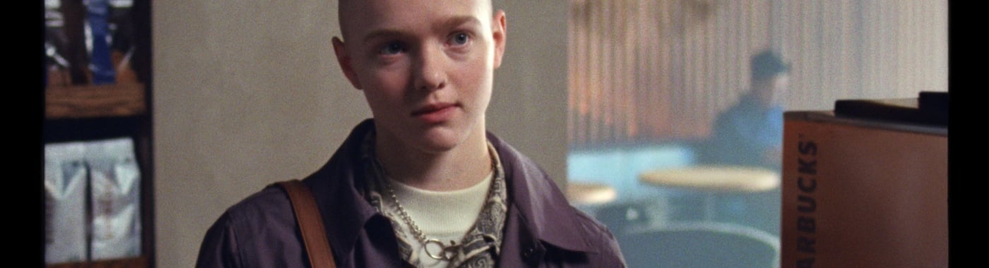
However, there is only one campaign that changed my whole career and that’s Starbucks “Every Name’s a Story”. The 2019 C4 Diversity Award’s winner follows a young trans person being deadnamed, and then ordering a Starbucks with their chosen name and shining with euphoria.
Why this ad? Well, I also came out in 2019.
In 2018, when I asked online how to ‘tell If I was trans’, one of the most common bits of advice was “go order a coffee with a new name and see how it feels”. By simply portraying a community truth, beautifully, it does the magical thing of putting a real human into your telly, which for the trans community - who are so often dehumanised into a debate - is desperately needed.
It started my journey to wanting to make more ads like it, and now I get to for a living, as my real self.
Corinna Field

Co-Founder
Red Lion PRDove, Dove and more Dove – is obvious but absolutely cannot go without mention. How could it, after years of campaigns; from the Real Beauty campaign of the noughties, to its more recent CROWN research?
The CROWN Act was a law put in place to end long-held racial bias against Black hair in the workplace and education systems. The New CROWN 2023 Workplace Research Study (part of Dove’s self-esteem project) highlights that Black women’s hairstyles are still unfairly seen two and a half times more unprofessional by employers. Black women are 54% more likely to feel like they have to wear their hair straight to a job interview to be successful.
From the hard facts backing up the ‘why’, to the response that leveraged a powerful brand partnership with LinkedIn. All brought beautifully to life with photography showing traditional Black hairstyles in contrast with hairstyles Black women adapt their hair to. The layers were all there, from the workshops to give parents the tools to boost hair confidence in kids, to the petition to make hair discrimination illegal.
Whilst the level of impact is not readily available online, what strikes me is the longevity. It is the latest in a long line of actions that all serve to reinforce the idea that the brand is for the women that buy it. This is strategic comms at its finest and I love it.
Daisy Phillips

Creative Director
Manifest GroupMy most-loved inclusive campaign is Sport England’s This Girl Can. Launched in 2015 it's one from the archive but its legacy endures.
So what do I love? Let me count the ways…
I love the clarity of insight - fear of judgement stops women exercising - and the fearless, fun creative that confronted that, arming women with joyous positivity and a campaign name that was both shareable hashtag and god’s gift to merch.
I love the clarity of comms, “Women come in all shapes and sizes and all levels of ability. It doesn’t matter if you’re rubbish or an expert. The brilliant thing is you’re a woman and you’re doing something.”
I love the casting. Real women, backed by the inimitable Missy Elliot, in a glorious sweaty celebration of diversity that made us all want to get our freak on.
But most of all I love that as someone who identifies as unsporty I felt seen. Sport England understood that not everyone feels at home on a netball court so instead of telling us to do more sport they reminded us of the simple pleasure that can be found in moving your body, whatever your body looks like and in doing so they moved us all - encouraging 2.8 million of us into exercise.
This Girl Can spoke to every woman (even me) and that’s why I love it.
Aimee Luther
MD
The Liberty GuildThe Last Photo campaign will stay with me forever. Written by the wonders at Adam and Eve DDB, it takes depression out from the darkness and into the light.In the realm of inclusive campaigns, the spotlight often tends to focus on visible forms of diversity, such as gender, race, and disability. However, “Last Photo” subverts these expectations beautifully. In the poignant images presented, we see young men and women smiling, joking, and simply being themselves. It’s when the message reveals that these were the last pictures taken before they tragically ended their own lives , it actually hurts. The phrase “Suicidal doesn’t always look suicidal” is a piercing insight that shatters the myth of despondent individuals quietly brooding in their bedrooms. These dearly missed faces – fathers, daughters, best friends – were people who laughed and joked, just like you and me. This is what suicidal really looks like – ordinary people grappling with an extraordinary burden.So, as we navigate the landscape of inclusive campaigns, I urge you to seek out a more powerful and normalising advertisement than this one for CALM (Campaign Against Living Miserably). This campaign serves as a poignant reminder for both those who bear the weight of depression daily and those who may be unaware of the pervasive stigma and preconceived notions of what suicide “looks like.”The truth is, it looks just like you and me.
Jeremy Page

Executive Vice President and Global Director of Creative
KWT GlobalGymshark's "Every Strong Belongs" marketing campaign inspired diversity and inclusion, championing diversity, strength and inclusion in all forms including overcoming personal challenges.
The gym locker room stands as a common ground - the crossover point for all gym goers, regardless of who they are and how they train. Visually represented in the campaign by 18 incredible athletes. Leading with the message "Our strong may be different but here, Every Strong Belongs."
One of the most powerful videos in the campaign features transgender powerlifter Angel Flores. Flores talks about her journey to becoming her true self and how fitness has helped her build confidence and strength. She says, "Bravery is being yourself, even when the world is telling you not to be."
Gymshark's "Every Strong Belongs" campaign is a refreshing and inspiring celebration of diversity and inclusion in the fitness community. It acts as a catalyst to move the industry forward as it serves as a reminder that everyone has the right to feel welcome and included not just in the fitness space but across all industries, regardless of their background or identity.”
Jim Coleman

UK CEO
We Are SocialOne of the stand-out pieces of advertising in the last few years was the Starbucks ad, Every Name’s a Story.
Its impact comes from the combination of a global brand, a high-profile topic, and a beautiful demonstration of the power of being asked for your identity - something unique to the Starbucks experience. We rarely see so many elements come together so well in a piece of advertising, and the result is engagement so high that you talk about the ad and share it with others – and not just those people in the industry!
We need pieces of work like this. It’s a bold campaign from Starbucks that has decided to highlight just one unique customer's experience, which is a very small amount of its total customers. The halo effect of this message is that “we accept you for who you are”, a powerful message to all of us who want our experiences with any brand to reflect our values. Finally, the tone, craft, and perfect pace of the story help diminish any self-righteous feelings you might have about a brand playing in this area. Work like this is hugely inspiring.
Mike Chivers
Creative Director
The PHA GroupBeing involved in people centric initiatives at PHA, which adapt, grow, and evolve to help set staff up for success, we’re look at those leading the charge and for best case examples we can reference and learn from.
Responsible for the creative output of the agency and clients, accessibility rides high on my agenda. Not only for the resultant assets, but also the journey to get there. I want to create a safe space to ideate within, then ensure ideas can be communicated and received in the best way, and with the intended audience in mind.
‘Different minds, better outcomes’ is a campaign where it’s clear the same respect for accessibility was consider throughout the creative process.
Working from data that shows 97% of UK is exposed to OOH, but 20% are neurodivergent, Clear Channel, collaborated with household brands; Heineken, Arla, Keep Britain Tidy & LeoReader, in a initiative to inspire change within the advertising industry.
Focused on being inclusive and accessible to neurodiverse customers, together they produced new or adapted artwork, making it ‘neurodivergent friendly’.
Several techniques were adopted; concepts simplified. Colour contrasts increased. Fonts used without capitalisations or serifs making them more dyslexia-friendly. And, for hashtags, CamelCase, making them easier to read.
The outcome; ads were cleaner, higher in definition and more impactful. Able to communicate messages more quickly and effectively.
But it’s not just about the receiver. This campaign recognises and supports the neurodivergent individuals who make 54% of the advertising, marketing and media industry, wanting ‘to create a working environment that helps them do their best work and succeed to inspire future generations.’