How nostalgia for the pre-smartphone era is driving design in the age of AI
Type is an impactful design choice that can speak volumes about where we are as a society, says Damien Collot

Damien Collot
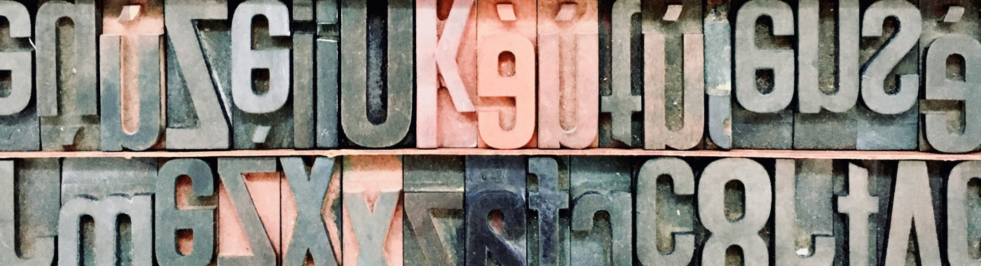
Creative Type Director MonotypeTypography speaks to us all the time. From advertisements to brand logos to packaging labels, typefaces surround us constantly as we go about our daily routines. Type is an impactful design choice that can speak volumes about where we are as a society - what matters to us, what drives us, and where we might be headed.
In this year’s edition of Monotype’s annual Trend Report, we unpacked what type might be telling us about 2024. Far from just identifying design trends, this report unpacks how type and cultural trends intersect; how type ebbs and flows with broader societal trends and what that can tell us about the modern cultural zeitgeist.
Type is an impactful design choice that can speak volumes about where we are as a society - what matters to us, what drives us, and where we might be headed.
Damien Collot, Creative Type Director at Monotype
Rooted in nostalgia
One of the driving forces we’ve seen in this year’s trends is a sense of nostalgia for the digital simplicity of the pre-smartphone, pre-AI era. We’ve designed the entire report around this yearning for the analogue world; imagining each of our ten trends as worn vinyl LP covers, connecting each type to a specific music genre - from jazz to 90s hip hop to UK rave.
Music is jam-packed with cultural elements. Record covers and labels have a rich history that’s influenced many areas of design and visual culture - think Peter Saville’s Joy Division artwork and the ransom note letters of punk. The theme of music was, therefore, a natural fit for typography, since it has a lot in common with music - both are about freedom and creativity - and in fact, some of the best type designers I know are also excellent musicians.
But beyond the design of the report itself, nostalgia is a subliminal influence throughout the entire report, connecting many of the trends. Type trends like Whatever demonstrate a resurgence of ‘90s aesthetics, with typefaces encompassing a spectrum of styles from nihilistic grunge to big bold types. From Barbie and Saltburn to new logos from Nickelodeon, Jell-O, and Slurpee, the resurgence of retro typefaces capitalizes on a broader wave of Y2K nostalgia that infuses music, fashion, film, and design.
A return to comfort and familiarity
So why the move to playful designs reminiscent of millennials and Gen Z childhoods? Perhaps it signals an escape into a time that seems distant from today’s collective anxieties about change - from climate change, to the rise of AI, to fragile global economies.
Other type trends we identified for 2024 also demonstrate this collective decision to turn towards typefaces and designs that bring a sense of comfort and familiarity, a return to traditional heritage and away from the minimalistic ‘blanding’ we’ve seen prevail over the past several years. We as type designers are particularly excited to see this transition into a more visually diverse type landscape - even if it’s just a case of experimenting with serifs (see our Return of the Serif trend).
We’ve seen movements towards expressiveness, joy and playfulness, for example Quirk - this trend incorporates unexpected details like bendy or curly letter shapes, or Counter Attack, which heroes negative space in letterforms. There is also the charmingly named Profeshinal, where designers have injected a modest childlike or laidback spirit into projects, often via handwritten scrawled lettering. I think this trend in particular, speaks to a desire to go back to basics. When you see something handwritten, it feels a bit more approachable and familiar - it’s not intimidating and it’s not as futuristic or even post-future!
Yet… inspired by AI
As we curated this year’s report, we saw a curious dichotomy emerge between the nostalgia and yearning for a pre-AI era and our immersion in the new AI-infused digital age in which we all live in today.
Perhaps in response to the rise in generative AI that shaped 2023, we’ve seen designers take inspiration from the chaotic surrealism of AI-generated art. The trend Everythingallofthetime sees creatives use all of the typefaces, textures, and technology available to them in a single design. Coca-Cola’s latest limited edition flavor, Y3000, exemplifies this trend perfectly - the team leveraged generative AI to co-create both the flavor and the packaging design. The result? Coca-Cola’s iconic logo made up of hundreds of fluid dot clusters and intricate patterns.
AI has learned design from humans, but perhaps the tide is turning - is it our turn to learn design from AI? Tugging on this cultural discourse, we turned to AI ourselves - using Midjourney to create the imaginative and visually stunning vinyl covers that map to each trend. Tapping into this tool allowed us to delve into unexplored aspects of AI image generation and animation, opening up fresh avenues and areas of exploration for our creative team - reflecting on the way designers have been using AI to unlock new possibilities in the creative process.
So what does type tell us about 2024?
It’s clear we’re in a period of rapid change, breakneck innovation, and instability. Perhaps in reaction to past years trends where tech, and especially AI, arose fast and in force, creatives want to counterbalance the smooth, sleek and clean effects by the handmade, slightly rough graphic elements and letter shapes. Making space for craft is a way for us to push back from the turbo speed of AI and shout about its much needed and valued place in society.
Yet the allure of AI is too compelling to completely turn our back on it - new breakthroughs in generative AI are providing a key source of design inspiration. So while we may yearn for the times before smartphones and AI, we can’t help but keep one eye pointed towards the future.