Fuel Your Imagination
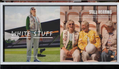
White Stuff campaign celebrates the Lionesses who blazed the trail
The Still Roaring campaign honoured the pioneers of women’s football.

How branding is helping to carve out a new unique identity for Women’s Football

As a female footballer who loves all things colourful and creative, you can imagine my pure joy back in 2020 when the Women’s World Cup ‘23 logo and branding was revealed.
Up until then, I’d always found the general visual language of football very traditionally ‘masculine’. Taking itself very seriously, in the men and women’s game alike. The design always seemed very much focused on the speed, power, physicality and force of the game. And most of the time – the winning. With the trophy often becoming the primary emblem of tournaments.
And whilst women’s football has all of those features of a competitive sport on the pitch, the key difference that sets women’s football apart for me, is the atmosphere in the stands.
Having attended both men and women’s football games alike, the feeling as a spectator is a whole different ball game … despite being literally the same ball game. Whilst both are loud, passionate and exciting, there’s something different in the air at a women’s game. A sense of support. A more uplifting environment where enjoying the game and cheering on your own team is more important than abusing the opponent or giving grief to the ref. There’s less foul language. Less aggression. And less intimidation. Especially for fans who aren’t straight, cis males.
At men’s games it feels like everyone is there for the football, full stop. Whereas at women’s games it feels like you’re there for the football and all the other positive energy that comes with it. That emotional vibrancy is something I never felt was communicated in the branding of women’s football before, which is what made the Women’s World Cup ’23 design make my eyes light up.
Because it just makes sense. In the past few years, with the TV broadcasting of the Women’s Super League, and especially since the Lionesses’ euphoric performance and victory of Euros ’22, we’ve proved women’s football in the UK has a lot to offer. But a few years ago, when this branding was revealed, we were still very much operating in the shadow of the men’s game. Constantly being compared as a lesser version instead of being appreciated in our own right. And to be honest, our marketing felt that way. A copycat of our male counterpart’s branding.
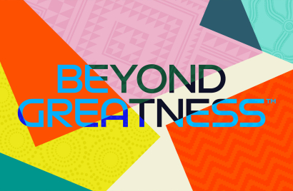
The women’s World Cup branding is bold in a whole new way. It’s fun. It’s fresh. And it’s still got football at the centre
Alice Banham, Senior Copywriter, IMA-HOME
As an advertising creative, it frustrated me. Because when advertising a challenger brand – you don’t market what it has in common with its main competitor. You find the USP and sell what makes it different. And finally, that’s what this new World Cup ’23 branding by Public Address and Works Collective felt like it encompassed. Celebrating not just the sport itself – but the bright, warm buzz that makes being at a women’s game (or even watching in public on a big screen) a totally different experience.
The women’s World Cup branding is bold in a whole new way. It’s fun. It’s fresh. And it’s still got football at the centre (quite literally), but in a way that feels more reflective of the feeling of the game. Whilst that doesn’t seem to have been the main intention of the branding, which is primarily a reflection of the spirit of its host nations, New Zealand and Australia, it’s definitely a positive side effect.
I could go on forever about all the nice touches. The fact that native female artists were brought in to create patterns that reflect the heritage of their countries. And the 32 squares included in the logo representing the 32 national teams taking part. It all comes together to create a balance of wonderfully clashing elements. The intricate aboriginal patterns with the bold blocks of overlapping shapes. The retro typeface with the modern cup illustration. And the neon colours with the muted tones mixed in. This world of contrasts again feels as diverse as the crowds at women’s games. Which are often made up of a much more varied cross-section of the population than men’s games. Young and old, male and female, die-hard fans and first-time footballers. This branding feels inclusive of every one of those attendees.
Visuals aside, the campaign line for the tournament ‘Beyond Greatness’ has been left open to interpretation. To me, it again represents that this tournament goes further than the greatness of the players and the greatness of what’s happening during each 90 minutes. It’s about much more than that. It’s about an experience that’s beyond great.
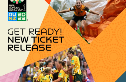
This entire branding really starts to give women’s football its own identity. It sets a new tone and allows us to establish our own world of football that’s vibrant and full of hope – helping us continue to proudly set ourselves apart from the men’s game. And ultimately, sell more tickets so we can continue on our streak of selling out stadiums!
Banham is a left-handed creative who loves coming up with left-field ideas and playing left back on the footy pitch. You could say she refuses to do anything ‘right’. And she’d probably agree. Since discovering her passion for advertising as a teen, she’s enjoyed tackling all sorts of briefs, for all sorts of clients, from all sorts of unexpected angles.
Looks like you need to create a Creativebrief account to perform this action.
Create account Sign inLooks like you need to create a Creativebrief account to perform this action.
Create account Sign in