Fuel Your Imagination
CoppaFeel brand refresh aims to reach a new generation
The charity has worked with Livity to encourage young people to check their chest
Paper specialists Fedrigoni issued a call to action for all artists to express their interpretation of love

Love is the universal language that transcends countries, borders, barriers, and differences - so the old trope goes. And it’s true - it’s the one common thread that connects us all. It doesn’t have to be romantic love. It can be familial love between siblings, paternal and maternal love, the unconditional love between pets and their owners, the love of an art or a project. However, being such a strong emotion, love for some can also mean heartbreak, loss and anguish.
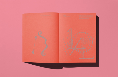
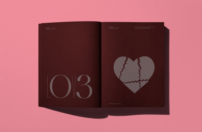
Valentine’s Day is a time to celebrate all these different forms of love. This year, paper specialists Fedrigoni issued a call to action for all artists to express their interpretation of love. 365 creatives had the opportunity to share their idea of love, with each assigned a specific day. The result is a calendar-cum-book, with a design for each day of the year. The book is printed on a mélange of red to pink hues from Fedrigoni’s vast collection of fine papers, each range showcasing unique features – from uncoated to coated, smooth to felt-marked, pearlescent to recycled.
Designed by TM and printed by Identity, the book covers and spines were assembled at random, with varying coloured front and back cover boards glued to each book block. The process has been purposefully left to chance, allowing each edition to carry its own visual signature and message of love, bringing together both complementary and juxtaposing mixes of colour. A limited number of Fedrigoni 365 LOVE can be purchased from Counter-Print, with profits from sales donated to the British Heart Foundation. To date, the Fedrigoni 365 project has raised more than £25,000 for different charities.
So, what does love look like? We spoke with several of the creatives who contributed to the project to find out how they came to their interpretation.
The creative challenge of how to bring LOVE and the date together, made the outcomes more meaningful. For myself, it was great to step away from my Mac and sketch out a range of quick-fire responses around what LOVE means in today’s culture, before choosing and crafting our final, playful tongue-in-cheek comment on LOVE in the age of mobile dating apps.
As it has such an open brief, a relatively short deadline and no client driving the outcome, it allows us to be playful and a bit more instinctive with the solution. This year's focus on love led us to a simple linguistic idea, but one that made us look more closely at the details in the wood type in our collection. After searching through many cases of type, we finally choose a charming and quite unusual slab serif, with counters in the W and Y that are reminiscent of little love hearts.
As designers we are often time-tight and responding to client briefs and exceptions. This project, however, gave me an opportunity to allocate some time for engaging with the process. For me, this involves actively not working on a computer and instead actively engaging with work of a more physical nature.
I’m a great advocate for embracing chance. Or to be more accurate, creating a space where chance can happen. At the time I was allocated my date for 365 LOVE, I had been shown some old book binding tools in the workshop at the University where I work. The tools are essentially characters that you would find in a letterpress studio, made of metal, attached to wooden handles. They are placed on a hot rack, and the metal heats up to a temperature you can then apply foil-blocking with. From what I understand a skilled book-binder could furnish the spine of a book with these for example.
Not being a ’skilled’ book-binder, I appropriate their use for more graphic purposes. Playing with letterforms, pressure and colours of foils.
Play is an important aspect of my design practice. By ‘play’ I mean creating a space for ideas and designs to manifest and develop. This space is often more about ‘doing’ than ’thinking’. This allows us to exercise and use parts of our brains in a different way.
For me, the open nature of the 365 LOVE project afforded time to play, time to experiment, time not to think. Time to try, time to fail, and time to take a small design journey using an abandoned printing technique.
For me one of the most meaningful aspects of Fedrigoni LOVE 365 2023 was the exploration of the topic itself: how much it made me reflect on what love means to me and how as individuals we express it. When trying to whittle down ideas to a single solution for August 13th, I realised just how much we underestimate its importance to us, and the vast number of ways it manifests itself in our lifetimes, emotionally or visually. From it being a feeling we cherish, a simple graphic mark, a Roman mythological God (as our submission became based upon), a song or a lyric, or even having its own five languages. Love surrounds us in many forms and we would be lost without it. Knowing this was possibly the same thought 364 other creatives were experiencing to create their submission, to create a book full of ‘love’ in our own individual expressions that would ultimately raise money for the British Heart Foundation, was such a great feeling.”
Soapbox is a creative studio for ideas that matter and this goes for our clients and the design community. This project gave us an opportunity to do something different and create a piece that will sit alongside many great designers – how often do you get to do that?
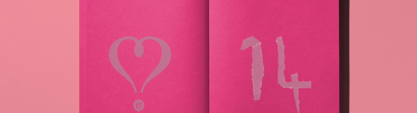
For us, the most meaningful part of the project is working together to come up with an idea – all ideas are good ideas. We work as a team until an idea comes to fruition and then a designer will take the lead on bringing that idea to life. The whole team continues to feedback helping to develop the design - it's a real team effort. This year, Camilla Susini created our entry for 14 November 2023. Camilla worked with paper, tearing and scanning it to produce a number that evokes many of the feelings that come with love.
And of course, it goes without saying that the design community is creating this calendar for a good cause with profit from sales going to a different charity each year. It is a pleasure to be part of this project.
Something that I really loved (no pun intended) about this edition was the addition of the theme. It gave structure to the creative brief, while also allowing everyone to come up with different answers and think about what love meant to them.
Personally, I didn't want to be too literal in my interpretation of the word and the theme. My date was August 3rd, and it was really tempting to make something with a heart (lots of similarities with a 3), but I thought that wasn't really a universal symbol or expression of love. I kept writing the word love and realised the E also had similarities with a 3, and went from there. In all types of love, it's very often about the things which aren't said, or saying multiple things at once. I loved the idea of mixing the word love and my date and making a lettering piece around that. The O and E double up as a 0 and a 3, and you can read both at once.
As somebody who draws type and works with type daily, the most meaningful thing is invariably to come into a room and see how 365 creatives have played around with numbers, letters and glyphs. It never fails to amaze me how incredible, malleable and resilient typography is as a material, and how innovative people are.
Looks like you need to create a Creativebrief account to perform this action.
Create account Sign inLooks like you need to create a Creativebrief account to perform this action.
Create account Sign in