Fuel Your Imagination
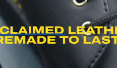
Dr. Martens champions sustainable fashion
Genix Nappa, a new material made of leather offcuts, aims to reduce waste
Over the last century logos have evolved from complex designs to simple marks. Perhaps a changing, adaptable design is the future for brands to keep up with our rapidly moving, constantly innovating world.

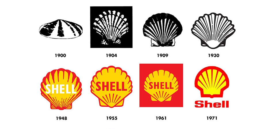
In England in the 1800’s, Marcus Samuel, a curiosities dealer in London started selling shell-covered boxes to children and tourists. As his Shell Shop prospered he took on new merchandise of various kinds such as jewels, kerosene and oil. By 1830 his company went world-wide and consolidated as the Shell Transport and Trading Company in 1897. Due to his earlier specialty, the company adopted the simple drawing of a seashell as its trademark. This has since become one of the world's most recognised logo designs.
Logos have existed in some form for longer than you might imagine. From coins to crests these ubiquitous marks are a sign of provenance and value. However it was the industrial revolution and the introduction of mass produced products that gave birth to the logo that we know today.
But a lot has changed in 100 years, particularly our concept of brand and corporate identity. As the advertising industry grew, companies realised the advantage of identifying themselves as the creators of the products they produced.
Today logos don’t just belong to products and companies. Sport stars, particularly those on the tennis court, have made them a part of their personal identity. Roger Federer, Venus Williams and Novak Djokovic have all reflected their history, culture and personal style in their own design, much like a modern-day coat of arms.
Over the last century logos have evolved from complex designs to simple marks. Some, like Atom Bank, keep evolving. The digital finance company created 1.4 million versions of its logo as a way of showing customers they are the bank that will adapt and mould to you. Perhaps a changing, adaptable design is the future for brands to keep up with our rapidly moving, constantly innovating world.
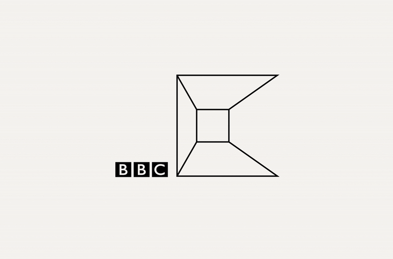
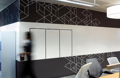
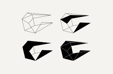
BBC Creative’s new playful identity is an ever-changing mark that morphs and moves across all platforms. Inspired by the BBC’s existing branding of letters in a box, the three-dimensional, line-drawn ‘C’ shape takes on different geometric shapes as it moves from merchandise to print and onto the walls of the BBC Creative Studio.
The contorting and flexing box shape looks a lot like origami while the restless logo represents the playfulness and imagination of the BBC Creative Team.
BBC Creative’s website has been redesigned in the same monochrome, linear style with simple, line-drawn icons used for buttons across the site.
Agency: Spin, London
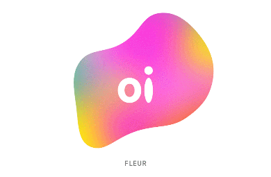
The transforming logo for Brazilian telecoms company Oi changes colour and form in response to people's voices. Volume increases the size of the logo, whereas changing pitches vary the colours and shape. Quiet, low voices create calm blue versions, whereas louder more high-pitched voices result in a more wild and fluorescent symbol. Moving, responsive versions of the symbol were used in live-action environments, whereas unique versions of the logo were generated for print.
Agency: Wolff Olins, London & Onformative, Berlin
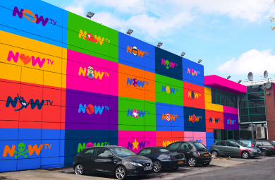
Alongside Sky, Venturethree created NOW TV, a streaming service to give people the TV they want, without the stuff they don't. A disruptive idea needed a disruptive brand personality to match. Describing its approach as ‘fun, easy, smart and spontaneous’ the branding is formed of bright colours and bold graphics. The brand idea ‘Easy Entertainment Satisfaction’ is captured in the changing nature of a logo where the central illustration is adapted for every genre. Iconic images and symbols from popular TV shows keep the NOW TV logo as adaptable as its service.
Agency: NOW TV, venturethree
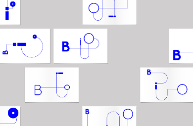
Bioengineering designs, builds and configures equipment for the international biotech industry. This ranges from the tiniest component to factory-sized production plants and it all takes place from their base in the small village of Wald, just outside Zurich. BOB created a new visual identity perhaps better described as a piece of visual engineering itself. It is a toolkit of letterform ‘components’ which can be assembled and reassembled in an ever-evolving set of ‘BIO’ marks, symbolising (literally) Bioengineering’s ceaseless inventiveness.
Agency: Rebranding , BOB Design Ltd
Looks like you need to create a Creativebrief account to perform this action.
Create account Sign inLooks like you need to create a Creativebrief account to perform this action.
Create account Sign in