Kellogg’s snacks debuts brand new look
A redesign of the Kellogg’s snacks range has been created in partnership with Landor & Fitch

Georgie Moreton
Deputy Editor, BITE CreativebriefKellogg's, one of the world’s most recognisable brands, is shaking up its snacks range with a new look created by Landor & Fitch.
The redesign follows in the footsteps of its 2019 rebrand.
The redesign comes following analysis of Kellogg’s share of the breakfast category which identified a new opportunity for the brand’s snacking range. According to its analysis the lack of ‘brand block’ on shelf, non-uniformity in packaging sizes and a powerbrand-led design system the packaging was not standing out as powerfully as it could.
“We saw the success of our cereal rebrand in 2019 and wanted to bring the learning and results from that into our snack range. We wanted to move from the established designs to make the range more edgy but without losing brand recognition which helps our consumers to spot them on shelf.” explained Niamh Cribbin, Kellogg Europe Marketing Manager
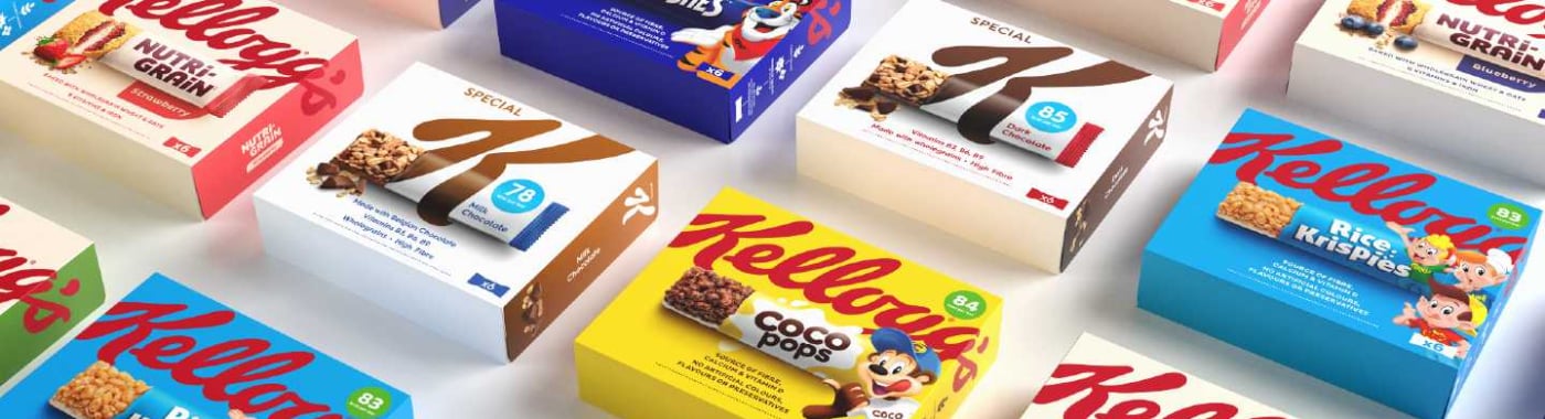
To rectify this the brand has created a new snacking identity that leverages the strength of its iconic masterbrand. Taking inspiration from the strategy behind its cereals rebrand, the new packaging creates a more consistent look across the snacks portfolio to increase presence in the snacking aisles.
To create a more coherent look across the Kellogg’s brands, Landor & Fitch created new packaging that balances brand and product naming. A bold crop of the masterbrand logo sits at the top of the new design, with the snack specific assets elevated and centred underneath.
On each bar, audiences can see the product pictured ripped open to reveal shots of the bars within. The colour of each product box uses brand or product-specific colours and the recognisable red logo is constant across the overall design.