
Dr. Martens champions sustainable fashion
Genix Nappa, a new material made of leather offcuts, aims to reduce waste
The goal is that one day diverse representation and accessible design won’t have to be greeted with surprise. It will simply be reflected in products, systems and amongst designers themselves.

For most of us, moving through the world is pretty easy. Our morning irritations come from someone getting a tube seat before us, cutting in front of us on the pavement or even, god forbid, jumping the queue in Pret. Our experience of the world is one of freedom and crucially independence.
Now imagine you live in a world that feels as though it wasn’t made for you, that seemingly wasn’t designed with your independence in mind at all.
In her TED talk Why Design Should Include Everyone, the Irish writer and academic Sinéad Burke asked the audience to look at the world from a different perspective, one they wouldn’t regularly inhabit. Burke, who recently became a contributing editor for British Vogue, has achondroplasia, a genetic disorder that results in dwarfism. In her debut column she wrote, “I mean, what does it mean to be normal? Having Achondroplasia liberated me from this very narrow descriptor…my greatest challenges are the design of the built environment and society’s assumptions about what I can and cannot achieve.”
A too common assumption is that if you have a certain disability you can’t do certain things. But we should really be looking at how we can change and alter our world to allow every person, whether they have a disability or not, to feel they have equal opportunities.
People who are disabled are a hugely unrepresented and yet a major consumer group. There are around 10 million people in the UK living with a disability according to the Disabled Living Foundation. Globally, there are around 1.3 billon people with a disability according to the ratings company Fifth Quadrant Analytics. That’s a market the size of China. This is not a small, ignorable proportion of society but rather an enormous contributor to both the country’s and the world’s economy.
We need to design for a more accessible world because the one we live in was built by people whose considerations didn’t extend to people with disabilities, whether visible or not. “People are therefore disabled by the society they live in, not directly by their impairment,” said Dr Graham Pullin in his book Design Meets Disability. The goal is that one day diverse representation and accessible design won’t have to be greeted with surprise. It will simply be reflected in products, systems and amongst designers themselves.
This is a space where brands can step in, observing their current designs and looking into how they can be altered to make them that bit more accessible.
Do you remember opening your lunchbox at lunchtime? The excitement at what you were going to find inside, and the disappointment when there was an apple instead of that biscuit you know you saw in the kitchen cupboard.
Kellogg’s has gone a step further in improving the lunchbox with their latest campaign for Rice Krispies Treats. The popular snack has a blank white heart on the side of the packaging that allows messages to be written to kids. But what if a child is unable to see those messages?
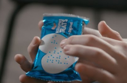
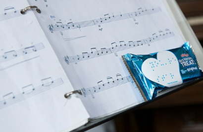
The brand, in partnership with the National Federation of the Blind, worked with Krispr (Edelman) to create Love Notes. They designed sheets of heart-shaped stickers that have messages written in Braille on them. There are eight different notes of encouragement which can then be stuck onto the snack packets.
They have also created boxes designed to fit one snack bar in which contain pre-recorded 10-second messages for children who do not read Braille or who are auditory learners.
The blank heart has been a feature on the packaging since summer 2017 but the brand wanted to push to make it more inclusive and accessible. The campaign video stars Eme Butler-Mitchell, an 11-year-old girl who Kellogg’s were introduced to and who is the inspiration behind Love Notes.
Kellogg Co’s founder W. K. Kellogg went blind in later life and started a namesake foundation which helps children with disabilities in schools, amongst other outreach programmes.
For the campaign, Starcom offered media support while Leo Burnett/R24 worked on the Love Notes landing page and social for the campaign.
Agency: Krispr (Edelman), Chicago, USA
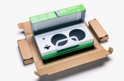
In May this year, Microsoft released their Xbox Adaptive Controller, a simple, innovatively designed device which nonetheless changed the gaming landscape for people with disabilities. But having designed the controller Microsoft realised they needed to look at the packaging it came in to make it easier for users with limited mobility to open. The design team worked directly from feedback given by around 100 gamers with varying disabilities. The box has loops and hinges instead of ties and tape. The loops are an essential conclusion from the design team’s research which realised that many gamers who are disabled use their teeth to unbox things. This redesign is not a tokenistic move just for people who are disabled but rather uses learnings to make the packaging better for all gamers.
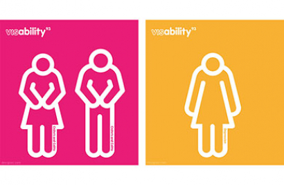
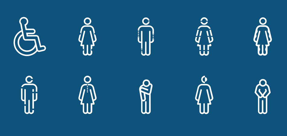
We all recognise the ISA (International Symbol of Access) when we see it. Designed in 1968 and therefore celebrating its 50th anniversary this year, the white icon of a person in a wheelchair against a blue background is a distinctive character. But 93% of people who are disabled are not wheelchair users and so are not accurately represented by this symbol. McCann London created Visability93, an internal project named after that percentage of people. The agency reimagined the universal symbol of access, designing a more inclusive and representative custom typeface of 27 icons, noticeably for those with so called invisible disabilities like diabetes, Alzheimer’s and epilepsy. Titled Icon Font, McCann London worked with the Invisible Disability Project to develop the symbols. The project plans to continuously grow the suite based on feedback and insight. Their principal aim is to raise awareness of people with disabilities that may not be considered ‘disabled’ by those around them.
Looks like you need to create a Creativebrief account to perform this action.
Create account Sign inLooks like you need to create a Creativebrief account to perform this action.
Create account Sign in