Thought Leadership
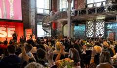
BITE’s Top Marketing Moments of 2024
2024 proved the power of doing things differently.
Flo Lau, Creative Director at Shutterstock, delves into 2021’s top trending colours and their use in marketing material to increase brand engagement.

Colours are so important to all of experiences. Even when you don’t notice them, there they are. They shape a place or support a visual with warmth or coolness, brightness or darkness, similarity or contrast. The power of colour comes from emotion; how we think and feel when we see them. From meanings set in history (red = danger) to deep-set biological reactions (yellow = happiness), we give story to colour as colour gives substance to our visual world.
Similarly, colour has an important role to play in marketing and advertising due to its psychological impact. The choice of a colour may be the difference between someone buying a product, or not. And in fact, studies show that a colour can improve brand recognition by up to 80%.
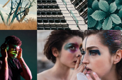
In our annual Colour Trends report, we look for colours that have seen increased usage in the last year, emerging in more image downloads from our creative and marketing customers than ever before. By looking at the HEX code data in each pixel, we can see the hues that are primed to dominate in the year to come. These are the colours that will tell the story of 2021, appealing to universal audiences in visuals across the world, and should be used in marketing material to increase brand engagement: Set Sail Champagne, Fortuna Gold and Tidewater Green.
It’s time to reset, and purifying colours allow us to have the room to finally breathe, relax, and think optimistically towards a new future.
Flo Lau
Can you see the sails unfurling on your personal getaway boat? After a year of head-jerking change, we’d all like to ship ourselves somewhere far away from it all. With its soft, organic feel, Set Sail Champagne is a natural, blank canvas of escapism; make it what you want, or need.
A fresh colour that presents a chic blank slate for designers, Set Sail Champagne is inspired by the paler hues that naturally occur in desert and coastal environments, mimicking the tones of sand dunes, bleached wood, or limestone. If you look closely, you’ll see that Set Sail Champagne is a soft, white tint of orange. The glow from its parent colour makes it a complement to blue-hued schemes, just like a sailboat on the open water. Try it paired with a classic baby blue or an oceanic teal, like this year’s Tidewater Green. As a pastel orange, Set Sail Champagne is also at home in any pastel palette. Give light colours a modern treatment with a glowing, holographic gradient of its analogous sisters: a rosy pink and a mellowed-out lime green.
Today, the need for serenity and reflection has never been more pressing, and the cleansing, escapist nature of Set Sail Champagne has inspired its name. It’s time to reset, and purifying colours allow us to have the room to finally breathe, relax, and think optimistically towards a new future.
The glow-emitting property of Set Sail Champagne has also made it a new staple in the fashion world, with designers like Max Mara and The Row consistently turning to buttermilk shades for timelessly chic, elegant, and ethereal collections. Brands can replicate this when looking to establish a high-end and elegant tone to a marketing visual, perfect for those in the fashion, beauty and travel industry.
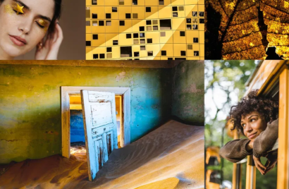
Fortuna is the Roman goddess of good fortune. Maybe you know her as Lady Luck. This warm, deep gold is her colour, representing chance happenings and happy coincidence. Like dappled sunlight at golden hour or autumn leaves lining city streets, you can find this exquisite yellow in life’s brief, shimmering moments of felicity and fate.
Fortuna Gold’s direct complement is Cerulean blue, creating a high-profile palette that brings to mind fields of wheat and deep blue skies. For a gentler palette, try Fortuna Gold mixed with Set Sail Champagne and other earthy tints, like terracotta or ochre. At its heart, this golden yellow is high drama, and it likes to be paired with other intense colours. Create a striking palette by embracing its amber qualities and pair Fortuna Gold with other jewel tones, like amethyst purple and turquoise green.
Use this colour to invest brands in a sense of establishment and history, whatever their age. A tint of Fortuna Gold overlaid across photos gives an instant Golden Hour effect, flattering complexions and making images feel instantly more serene and relaxed.
You can completely transform your projects with an intelligent use of colour.
Flo Lau
Like the sun rising, the seasons changing, and the earth spinning on its axis, the ebb and flow of ocean tides is constant. Tidewater Green is a reminder that change is a given. This deep, molten teal presents with both yellow and blue tints, adding to its dynamic power. At once a thick jungle canopy and a dark body of water, the beauty of Tidewater Green lies in its fluid nature.
Named after a little freshwater duck with a green-blue band on its wing and around its eye, teal is a hybrid colour that can sit closer towards either blue or green. Tidewater Green contains more green than blue, and gets its depth from its grey undertone. A dash of yellow also gives this colour a sense of energy.
With its roots planted in both the blue and green spectrums, Tidewater Green has a complex series of complements. On the colour wheel, its direct companion is another hybrid colour, red orange. These colours match up well in super saturated schemes that mimic the blue green of the ocean and warm pops of colour seen in fish and coral reef. Tidewater Green also works as a rich grey with unmistakable character. Use it to ground lighter, brighter palettes featuring its triadic counterparts, like an airy lavender or a modern sage green.
Tidewater Green is a healing salve after a turbulent year. Use this colour to revitalise your brand identity in 2021. Everyone is looking for fresh beginnings and no colour symbolises that change is a given more than this hue. It makes a striking alternative to dark green or grey and is best placed for a brand who wants to appear apart from the mainstream in an effortless and subtle way.
You can completely transform your projects with an intelligent use of colour. When choosing a colour scheme, it’s important to understand why you have made that selection. What does the colour mean and what impact will it have on the target audience? Don’t be afraid to try something new. Perhaps 2021 is the year for a fresh brand colour.
Flo is the Creative Director at Shutterstock where she specialises in digital marketing, brand performance, conversion optimization, and sales enablement for the brand. Over the past four years, Flo has built a collaborative team culture, partnering closely with leadership across the company to drive creative campaigns resulting in award-winning work. With over 10 years of experience as a creative leader, Flo is a designer and marketer at heart. She previously held senior creative titles at companies including Macy’s, Haier America and Consumer Dynamics. Outside of work Flo enjoys running with her husky pup, exploring nature and entertaining her toddler son.
Looks like you need to create a Creativebrief account to perform this action.
Create account Sign inLooks like you need to create a Creativebrief account to perform this action.
Create account Sign in