Hot Pick
Havas UK
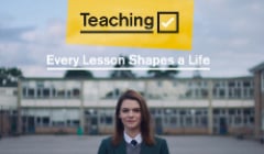
Department for Education
Charles Nix, Creative Type Director at Monotype explores the growing trend for nostalgia in type choices, for type as celebration and as both a reflection of the past and a nod to the future.

Typography is often considered a timestamp, a reflection of our history. As designers we can look back at the way type was crafted and applied to branding and advertising, used in album or film art or to promote cultural movements, and glean a better understanding of the prevailing psychology of the period.
Still, those of us who design type for a living also see ourselves as futurists. We analyse patterns and seek out the green shoots, the early signs of distinctive type for brands. Culture influences the stylistic choices we make, and in turn, the resulting typography influences global culture.
As we put an unprecedented year behind us and look forward to a hopeful albeit uncertain future, we believe strongly that creativity will help us realize our go-forward world. And when we examine the trends taking shape in the creative community, what emerges is a sort of struggle playing out between our rapidly digitising lifestyle and an equally strong yearning for something tangible. Perhaps it is a desire to have both: the whole world in our pocket, without losing touch with ourselves.
‘Nostalgia’ as a theme is not a driver for change, but it works as an expression of empathy in a world that seeks familiarity during difficult times.
Charles Nix
This is where the intersection of type as both a reflection of the past and a harbinger of what’s to come really becomes clear. People and brands alike are longing to return to the familiar. This has manifested in the upswell of comfortable letterforms from decades past, reimagined and repurposed for the world as it is today in striking, unexpected ways. More than just a nostalgic impulse, this seems driven by a desire for genuine connection in a world we increasingly experience through screens.
We refer to this phenomenon as ‘soft-serve’ and more brands are turning to it as a way to appeal to audiences while still providing a digital-first experience optimised for all devices. This trend is all about classic, full-of-character serif typefaces like Cooper Light and Cooper Black, typefaces that seem to pour forth full of curves and heft, easy on the eyes and welcoming you to sit and unwind for a while. But while those irrepressible favourites are still part of the picture, new twists on the old theme are joining the mix, resulting in a trend that explores the past in search of a deeper, meaningful connection with consumers.
Burger King is the latest brand to join the fray, winning acclaim with a soft-serve type of its own. My colleague Phil Garnham penned a piece exploring the company’s rebrand, done artfully by JKR with type from Colophon.
Food and beverage brands like Burger King, along with home goods providers, have spearheaded soft-serve as a trend over past years, including rebrands from Chobani (InHouse), Meridian (BulletProof), and Dunkin (JKR). In 2020, however, the aesthetic took off like a rocket ship, making inroads into other business sectors.
Pets were even more welcome companions in 2020 as many of us stuck at home sought out new, much happier office mates. And the pet industry, already quite personal and emotionally appealing, has several examples of branding centred on big, bold soft-serve typography. Online pet supply retailer Chewy employs a bouncy, rounded, almost, dare we say it? puppyish sans serif and Bark Box, a curated monthly subscription service, uses Burbank by House Industries to bark at consumers, and their humans. Cat Person, a high-quality cat food brand, leaned into the soft-serve trend in 2020 with a more refined application. Working with Mythology, Cooper was used alongside watercolour images of chicken, fish, and other key ingredients.
Masterclass, in collaboration with Gretel in NYC, is another example of a brand that took a differentiated soft-serve approach, pairing it with a bold colour palette to stand out from more typical tech branding. It also may be a favourite for type nerds everywhere, as the brand created individual, type-led identities for each of its new celebrity ‘instructors’.
Fisher-price, the iconic toy manufacturer, partnered with Pentagram on a new visual identity complete with custom typography meant to “capture the brand attributes of fun, action, play, celebration, silliness, and joy.”
The list of applications goes on and on, across global regions and industries, from big companies to small. Why? ‘Nostalgia’ as a theme is not a driver for change, but it works as an expression of empathy in a world that seeks familiarity during difficult times. There is comfort in the warm, soft-edged physicality of these letter shapes, a nod to a vintage era of playful swashes, fat serifs, quirky letters, and vibrant colour schemes.
These typefaces are also just a lot of fun, and brands seem to enjoy naming their fonts too: ‘Flame Serif’ for Burger King, ‘Let’s Be Glyphs’ for Fisher Price, ‘Dunkin Serif’ for Dunkin. This is type as celebration, reminding the world it’s OK to enjoy themselves.
This is an excerpt from Monotype’s Type Trends. To learn more about other prevailing trends in typography, view the full report on Monotype’s website
Charles Nix is a Creative Type Director, designer, typographer and educator. He designed a number of popular typefaces in the Monotype Library, including Walbaum and Hope Sans, which received a Certificate of Typographic Excellence in the 22nd Annual Type Directors Club Typeface Design Competition. He’s also designed custom typefaces for Google Noto, Progressive Insurance and the Philadelphia Museum of Art.
Looks like you need to create a Creativebrief account to perform this action.
Create account Sign inLooks like you need to create a Creativebrief account to perform this action.
Create account Sign in