Standing out in a sea of blue
Will Thacker, Co-Founder & Creative Director of 20something on a new brand identity the agency created for Seven Clean Seas and the importance of designing to counter to the visual norms.

Will Thacker
Co-Founder & Creative Director 20somethingThe eco-warriors and tree huggers we have associated with green initiatives in the past have never had the reach, and cultural influence to normalise sustainable behaviour. But now there is a new audience, an audience demanding sustainability be placed at the heart of the brands they interact with.
Millennials and Gen Z are at the coal face of change. This is an aspirational, younger, brand-aware and status-conscious audience. One which can really spread and influence change not just with their peers, but with the products and services they buy.
Social and environmental responsibility has become a part of their identity, a badge to adorn themselves with, a new currency of cool.
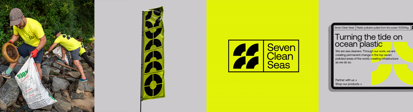
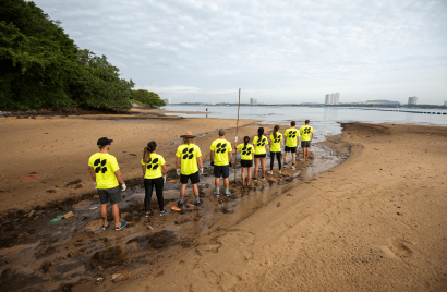
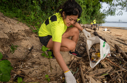
Seven Clean Seas (SCS) is a Social Enterprise who pull plastic out of the ocean. From humble beginnings, it’s now on a mission to remove 10,000,000kg of plastic, across the seven countries with the highest levels of plastic pollution by 2025. Primarily, they’ve worked on the ground in the form of manned beach clean-ups, but more recently, they have created a revolutionary high volume, low-cost River Plastic Recovery System, which collects plastics before they ever reach the ocean. To future-proof our waters, they teach as they go, educating on marine protection, responsible plastic consumption and empowering local communities to join the fight.
Sustainable, eco and social good brands need to evolve to make sure they look as good as the work they do. As larger brands and multinational corporations look to increase their eco-credentials, partnering with sustainable companies like Seven Clean Seas is the perfect way to do this credibly and to make a meaningful impact.
Anything a brand can do that runs counter to the visual norms of its category stands it in good stead.
Will Thacker
Progressive, modern branding
So, it's in the best interests of these companies to present themselves in the best light with progressive, modern branding that talks to a similar customer. There is no reason why they shouldn't look as good as the coolest brands out there. In this vein, so many categories are ready for disruption, even lettuce. Plenty, a late-sixties-California-styled vertical farming company shows us how.
We’ve all been wiping our rear ends the same way for hundreds of years, couldn’t we be doing some good while we’re at it? Who Gives A Crap is a toilet paper brand that builds toilets for people who need them. It has a beautiful, knowingly vintage aesthetic, and there isn’t a furry, cuddly creature in sight.
Barry Scott, eat your heart out, with the Bang + Olufsen of home-cleaning solutions, Veles. It’s made of 97% food waste and beautiful enough not to have to hide in a cupboard; it might even match your Farrow and Ball colours.
When was the last time your local rubbish company really caught your attention, or piqued your interest? Recently, perhaps, if you live in Auckland, where the illegal-rave-like Supertrash is shaking things up. Oh, and saving over eight million kgs of waste from going to landfill while they’re at it.
This is just to name a few.
Our brief was to create a new identity and help organise SCS’s strategic positioning to talk to this new, more influential, audience. But also, one that could flex to their B2B solution, allowing businesses to offset their plastic footprints. Seven Clean Seas is an ocean conservation business doing things no other business was, deserving of a brand identity no other business had.
A hands on, human-powered & action-driven identity
When you start looking into the ‘for-good’ category, especially businesses working to help the blue bits of our planet, you are faced with a barrage of surf and hippy-inspired eco-clichés. Aquamarine whales, turtles, bottles, and sometimes turtles made out bottles. Everything looks, feels and sounds the same, with only a few exceptions.
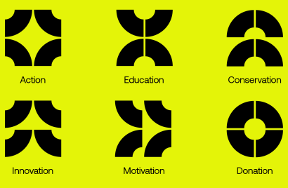
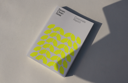
Seven Clean Seas’ work is hands-on, human-powered and action-driven, warranting an identity to match. We took inspiration from streetwear and utilitarian fashion, with a bold graphical system at the centre of the brand. The identity started with a single marque, inspired by ocean currents and their role in distributing plastic waste globally. The logo, formed on a basic grid structure, can be manipulated into different marques to create individual signifiers of the business’ core areas, from conservation efforts to educating new generations about the effects of plastic pollution.
The hi-vis near-neon-yellow was inspired by both the alarming nature of hazard signs, and the reassurance of hi-vis workwear, a nod to the very manual work that’s needed to be done. This creates a feeling of safety, but also alerts people to the work required if we are to significantly reduce the plastic pollution in our seas and oceans.
With functionality in mind, 20something also built SCS a suite of interactive filters that allows SCS and their clean-up members to create branded graphics in the brand’s colour, font and style, in the moment, as they work. Everything has been designed to be as actionable as possible and help Seven Clean Seas do their critical work with the reassurance that their brand is of an equal quality.
This idea of hands-on, workmanlike concept gave us the foundation, a different starting point, one that was unique to Seven Clean Seas. It moved us away from a sea of blue, into a more exciting space, one firmly rooted in the brand purpose.
There is a new generational craving for brands to do and look different, to break away from rulebooks written before the internet, let alone social media.
Will Thacker
Designing counter to the visual norms
‘For Good’, B Corp, ‘Planet Positive’, ‘People and Planet Positive’. Whatever you call it, it’s now its own category. Like any other category, to be successful you need to stand out, and to do that, you need a distinct, quality visual identity.
Across endless screens and zines, we are placing more importance than ever on how businesses in all categories look and feel, on the experience of the brand. Not to mention the scrolling, the mindless, zombie scrolling. Anything a brand can do that runs counter to the visual norms of its category stands it in good stead. We’re happy for you to zombie scroll through a sea of blue ocean-positive brands. We’re just hoping you’ll stub your toe on the near-neon yellow one, and maybe hover long enough for us to give you a taste of the business and what makes it different.
There is a new generational craving for brands to do and look different, to break away from rulebooks written before the internet, let alone social media. If marketing is war, the arrival of the internet has changed the battlefield from Normandy to Jupiter. It’s time to create dynamic new brands around a purpose and stop shoe-horning purpose into old brands.

About
In 2019 Will co-founded 20something, a creative company with a single mission to simplifying the over-complicated, make things people want to look at and to never compromise on creative work. Will has spent over 17 years working in a variety of successful agencies. His last position was at 18 Feet & Rising, where he spent three years as ECD. Will started out at FCB Inferno before moving to alternative agency Kesselskramer, both in London and Amsterdam. He also spent time at Leo Burnett, VCCP and Analog Folk. Over the years he has won Cannes Lions, D&AD Pencils, One Shows, Clios and has also been awarded by the United Nations for work with Amnesty International.