HI-CHEW shows the power of the bold and the bright to connect with Gen Z
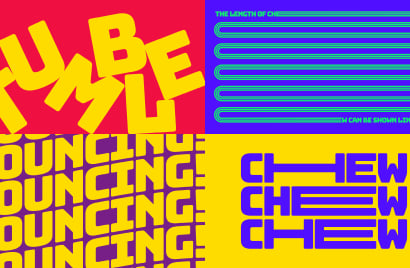
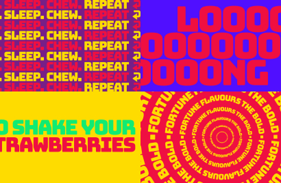
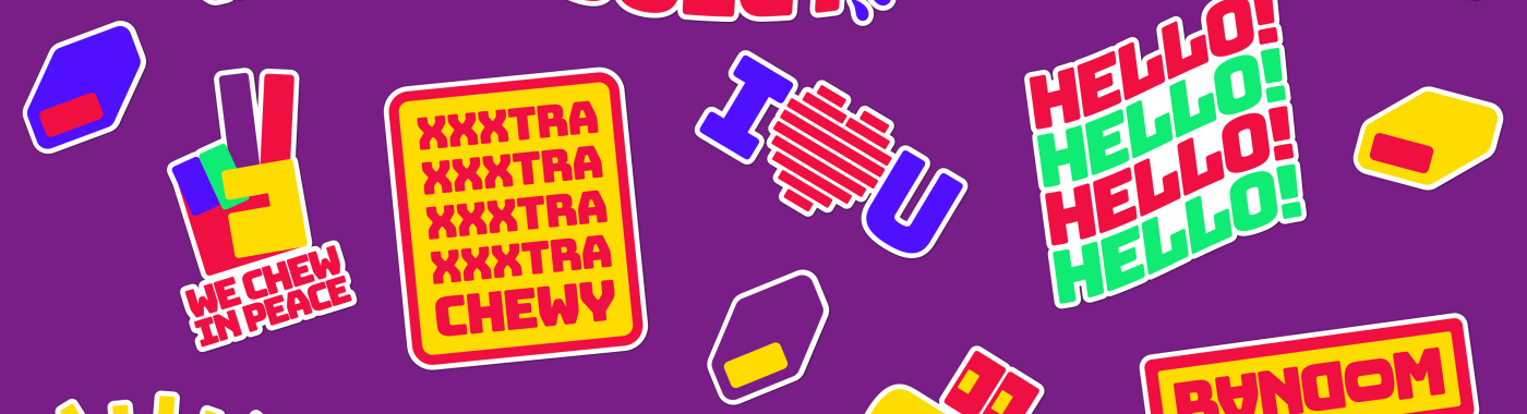
Short, sharp and irreverent at times, punchy colour combinations bring the intense fruit flavours to the fore, resulting in a brand world that is highly distinctive and fun.

Nicola Kemp
Editorial Director CreativebriefGetting the right visual language is key to building brands on social platforms. All too many brands are guilty of retro-fitting existing campaigns into social channels, reflecting a lack of understanding or respect for the language of social.
The power of visual language is underlined by Japanese fruit-flavoured sweet brand HI-CHEW, which makes its UK debut this month with a visually-driven brand ecosystem.
Created by Fold 7 the brand world uses expressive typography created with Bungee by David Jonathan Ross of The Font Bureau. The font was originally designed as a celebration of urban signage and aims to give a bold, confident, soft and stretchy look.
To create the brand’s visual language, accentuated by distinctive colours and stand out tones, the Fold7 team drew inspiration from Japanese TV graphics and street signage. Short, sharp and irreverent at times, punchy colour combinations bring the intense fruit flavours to the fore, resulting in a brand world that is highly distinctive and fun.
Founded in 1918, HI-CHEW’s parent Morinaga & Company, was the first modern confectionery company in Japan and is now the largest in Asia. The brand launched in the US ten years ago and has grown into a $90m business. It hopes to recreate this success with its UK launch, which is being overseen by Rob McNeilly, Head of Europe at Morinaga. McNeilly is focused on building awareness and distribution across the UK market.