Pip & Nut embraces simplicity in rebrand
The brand is bringing its logo back to the centre of its design architecture.

Nicola Kemp
Editorial Director CreativebriefThe 2026 trend reports are yet to hit adland, yet a consensus is already forming that simplicity will be at the very top of the marketing agenda.
For many marketers, the fundamental question of ‘when did everything get so complicated?’ is mirrored by consumers overwhelmed by choice.
It is a shift that is already being felt in the branding and design sector, where a growing number of brands have iterated themselves out of the very brand that made them unique in the first place. A fact that means the most modern approach to rebranding is to get back to basics.
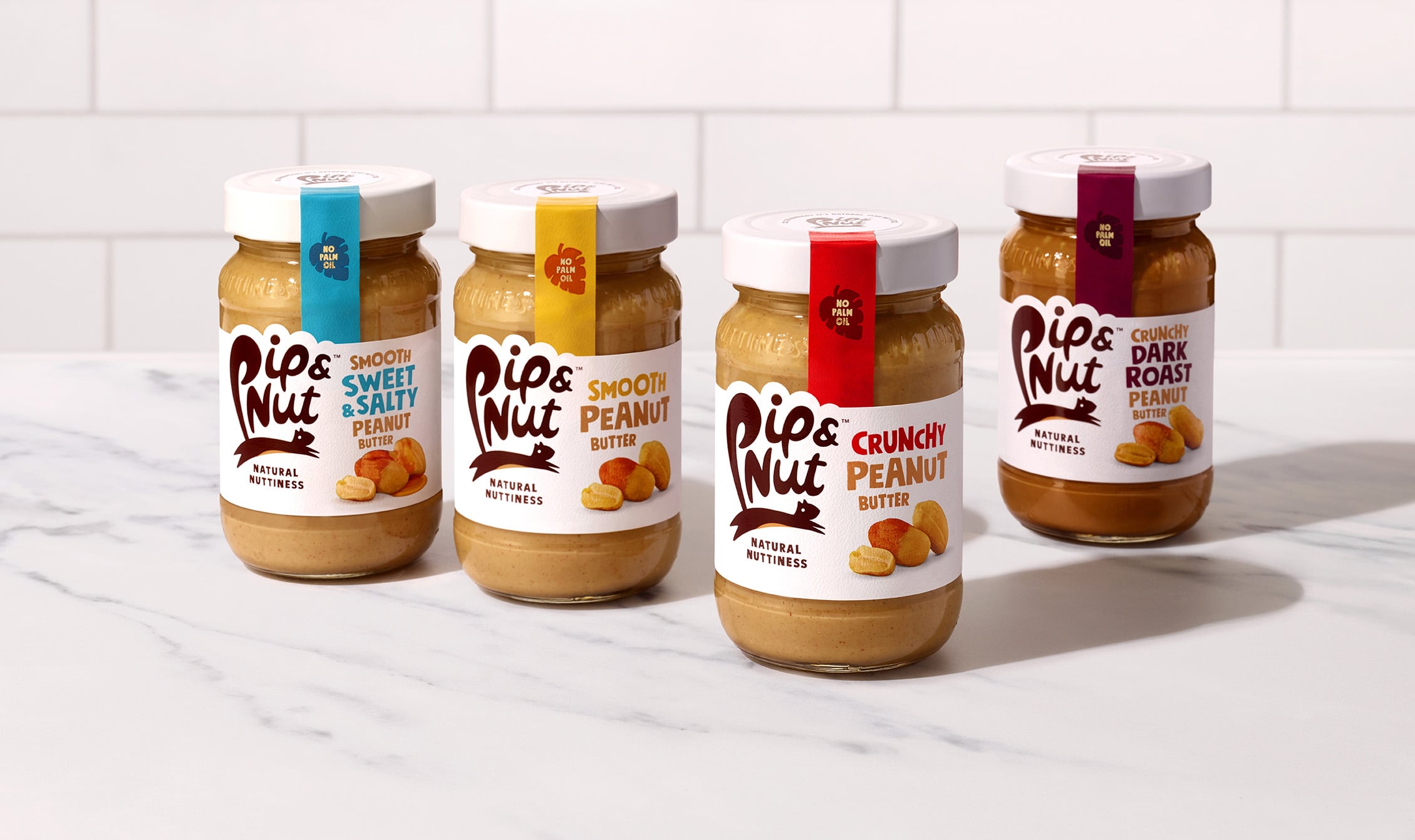
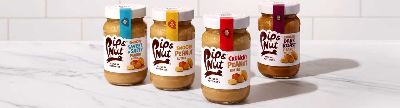
This is the approach taken by challenger peanut butter brand Pip & Nut, which has revealed a rebrand designed to take it back to its ‘iconic best’.
In recent years, packaging iterations had led to cluttered label layouts, with the brand’s instantly recognisable squirrel logo reduced in size to enable greater product communication.
The brand and its design agency B&B have moved to bring the logo back to the centre of its design architecture. A move which the company claims has improved differentiation, with brighter colours to enable more intuitive navigation of the existing colour coding system.
“From my first visit to the studio with a sample of my market stall nut butter, to collaborating with the team on this brilliant refresh, it has always been a pleasure to work with B&B,” explains Pip Murray, Founder of Pip & Nut. She continues: “The latest designs emphasise the unique personality that has made this brand so special from the start, and I cannot wait to see them on the supermarket shelf.’
Pip & Nut is a brand which has consistently redefined what it means to be a challenger brand and this latest move underlines the fundamental truth that sometimes the most powerful tool you have as a marketer is simplicity.