
Fuel Your Imagination
Divine places sustainability at the heart of new rebrand
The new look, created by Wildish & Co, underlines the brand’s sustainable ownership model.

The brand refresh from Mother Design aims to reflect the brand's focus on health, provenance and healthy cooking.

To solidify its position as the UK’s premium healthy recipe box service, Mindful Chef has kicked off 2026 with a brand refresh created in partnership with Mother Design.
The refreshed identity aims to differentiate the brand in a crowded category and highlight its commitment to health, provenance and quality food. The campaign launch comes at a time of year when consumers traditionally reappraise their habits after the excess of the festive period.
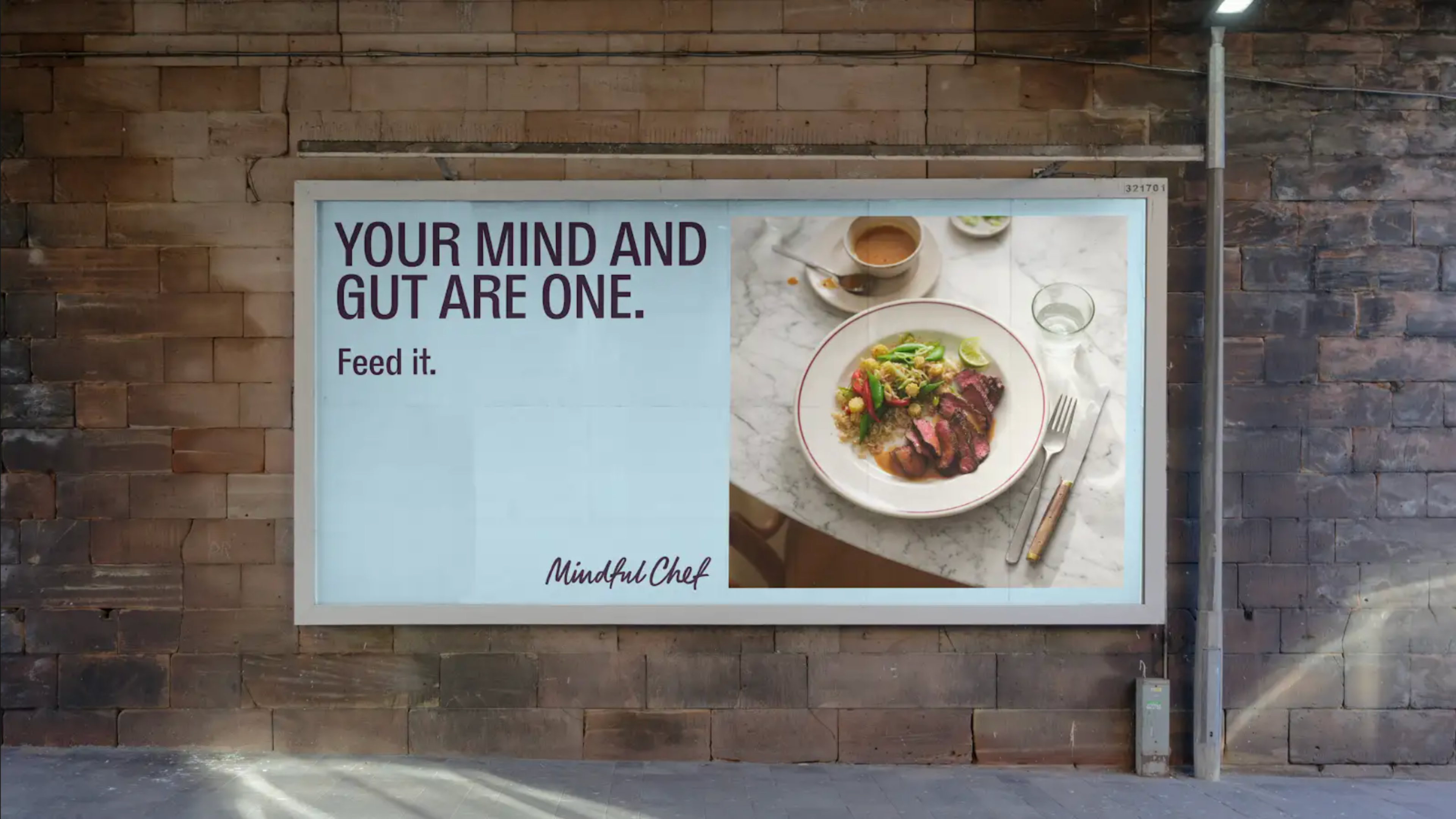
The brand refresh is centred around the Mindful Chef’s ‘Eat Well. Live better’ mission, focusing on health and underlining that the brand’s meal kits are health-focused and high quality.
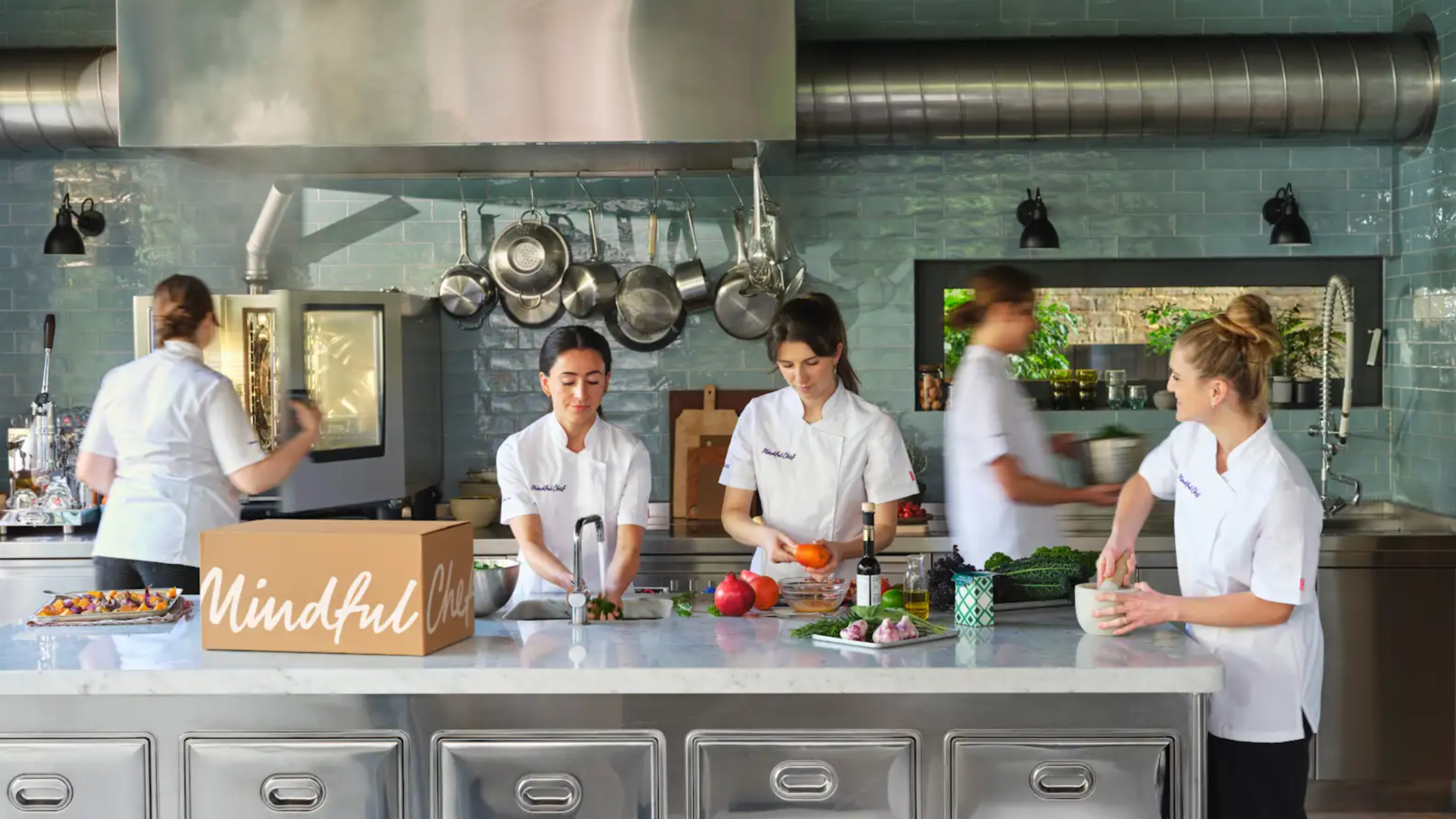
While the meal kit category is sometimes associated with convenience over care, Mindful Chef is passionate about finding the joy in food. Working with a team of chefs to create recipes that can be on the table in under 30 minutes, the brand refresh aims to connect audiences with food and communicate Mindful Chef’s high-quality, nutritious, easy proposition.
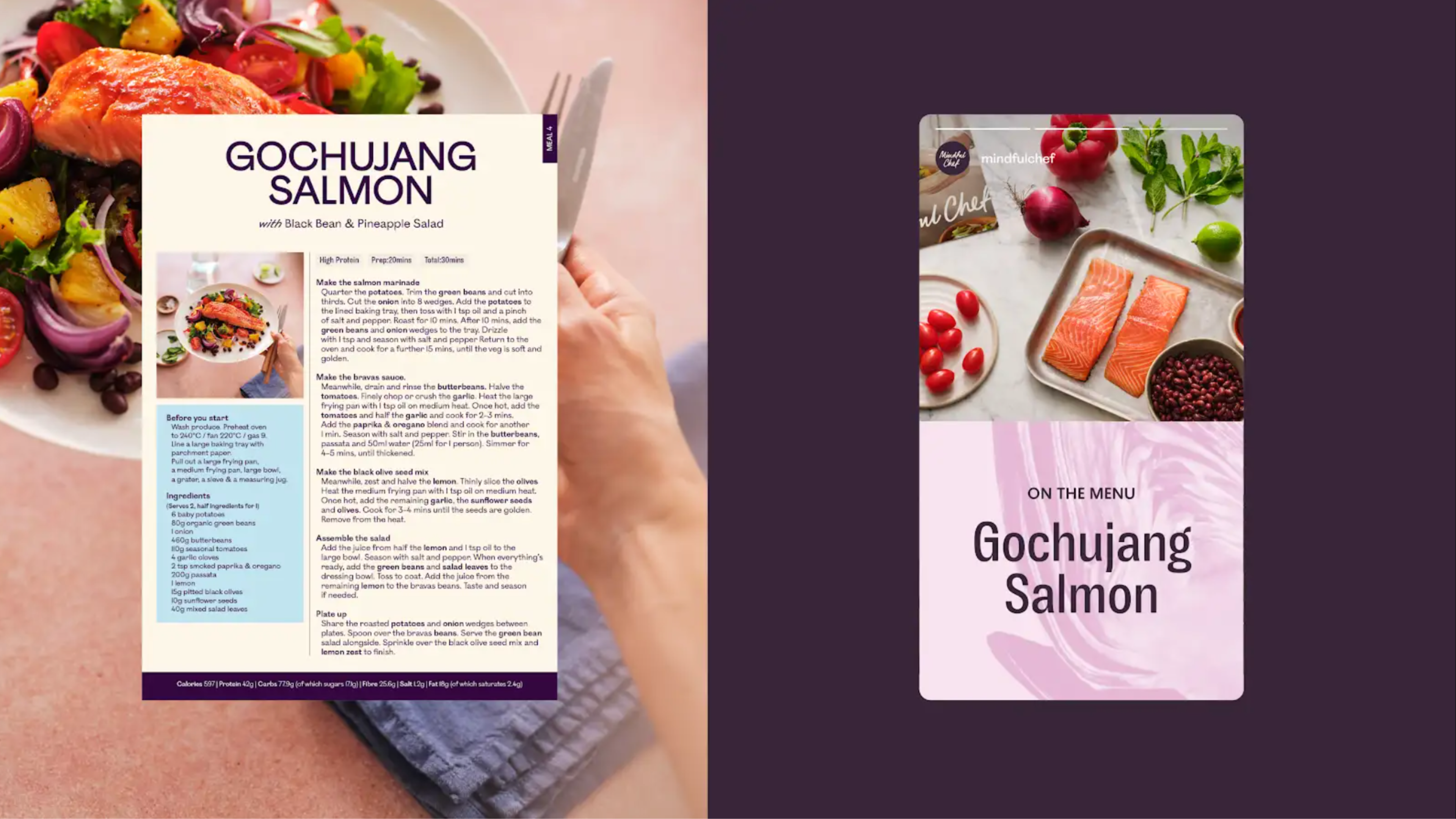
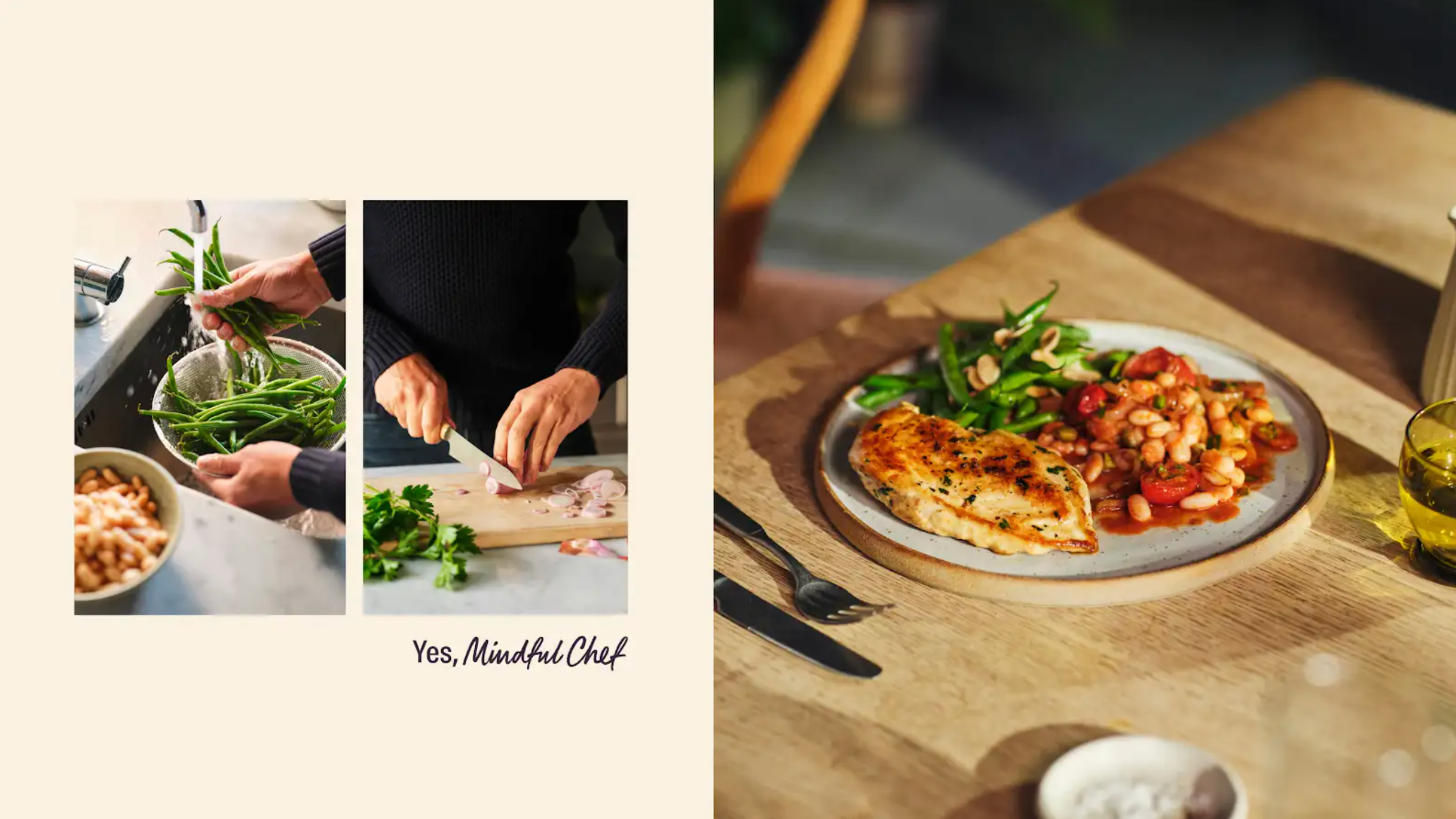
The new creative platform, ‘Yes, Mindful Chef’, positions at-home cooks as chefs to bring to life the brand’s culinary mission through the whole of its visual and brand identity, from its communications to its recipe cards.
Using design, imagery and writing that transforms its audience into chefs, the new brand identity focuses on the consumer and their kitchen. Communicating the joy in cooking, the design aims to show how simple meals can be culinary delights.
Every element of the design has been carefully thought out to communicate quality. A new colour palette has been evolved to reflect a variety of rich ingredients, from aubergine to oat. While typography, inspired by the visual language of culinary editorial, expresses rhythm, texture and taste.
“Our work brings together everything people love about Mindful Chef: chef-quality produce, joyful cooking moments and the pleasure of eating well. From typography to photography to the refreshed colour palette, every element has been crafted to celebrate the art of healthy living,” explains Jo Tulej, Creative Director at Mother Design.
A new photography style set to be revealed in a nationwide Telegraph feature sees the brand shun category conventions. Working with lifestyle photographer Yuki Sugiura, food stylist Emily Kidd and props stylist Rachel Vere, the shots make use of warm lighting, thoughtful props and real hands to show the full cooking journey and reinforce the customer’s role as the chef.
New layouts take inspiration from premium cookbooks and food magazines and a new tone of voice bridges the gap between chefs and customers to champion home cooks. New language choices celebrate ingredients and elevate the importance of health and joy.
The visual identity also puts a greater importance on the brand’s logo, which will be used within stories and imagery as well as across products to act as a stamp of high-quality, authenticity and trust.
The refreshed brand rolls out across Mindful Chef’s website, magazine, packaging, including delivery boxes, social channels, email and wider digital touchpoints, following its introduction in the Telegraph.
With a refreshed visual identity, Mindful Chef carves out its unique proposition of joy and quality in a crowded market, communicating its brand to audiences with authority.
Looks like you need to create a Creativebrief account to perform this action.
Create account Sign inLooks like you need to create a Creativebrief account to perform this action.
Create account Sign in