What’s more irresistible than Irresistible?
Real truth
Co-op’s premium range was performing well but they wanted to improve brand recall, differentiating themselves from other premium own labels. They wanted more space in their packaging design between their core and premium products.
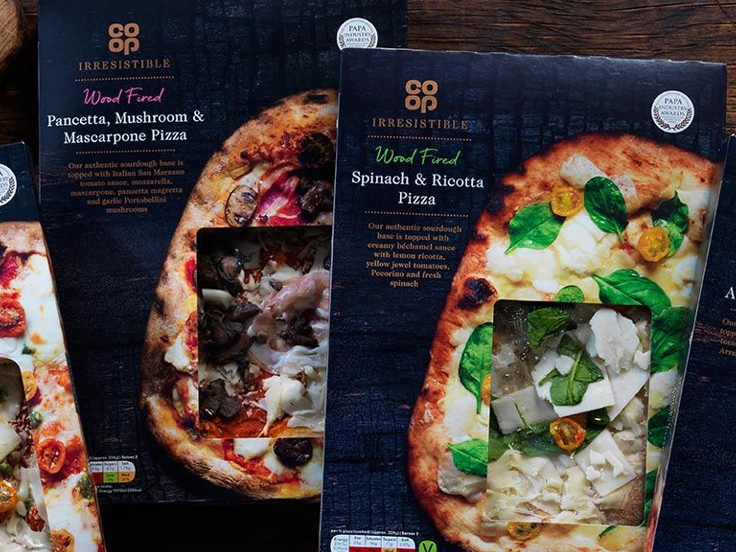
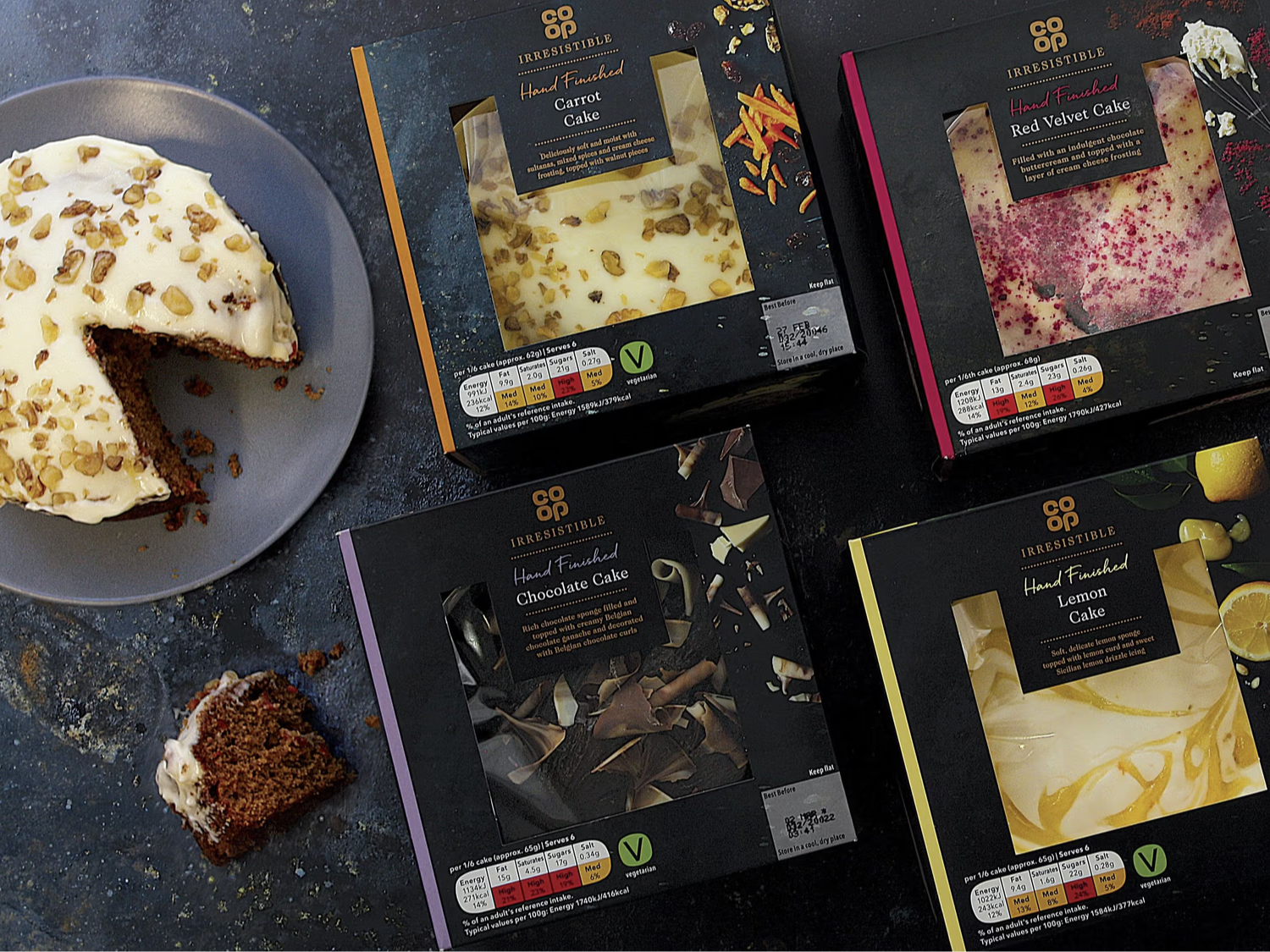
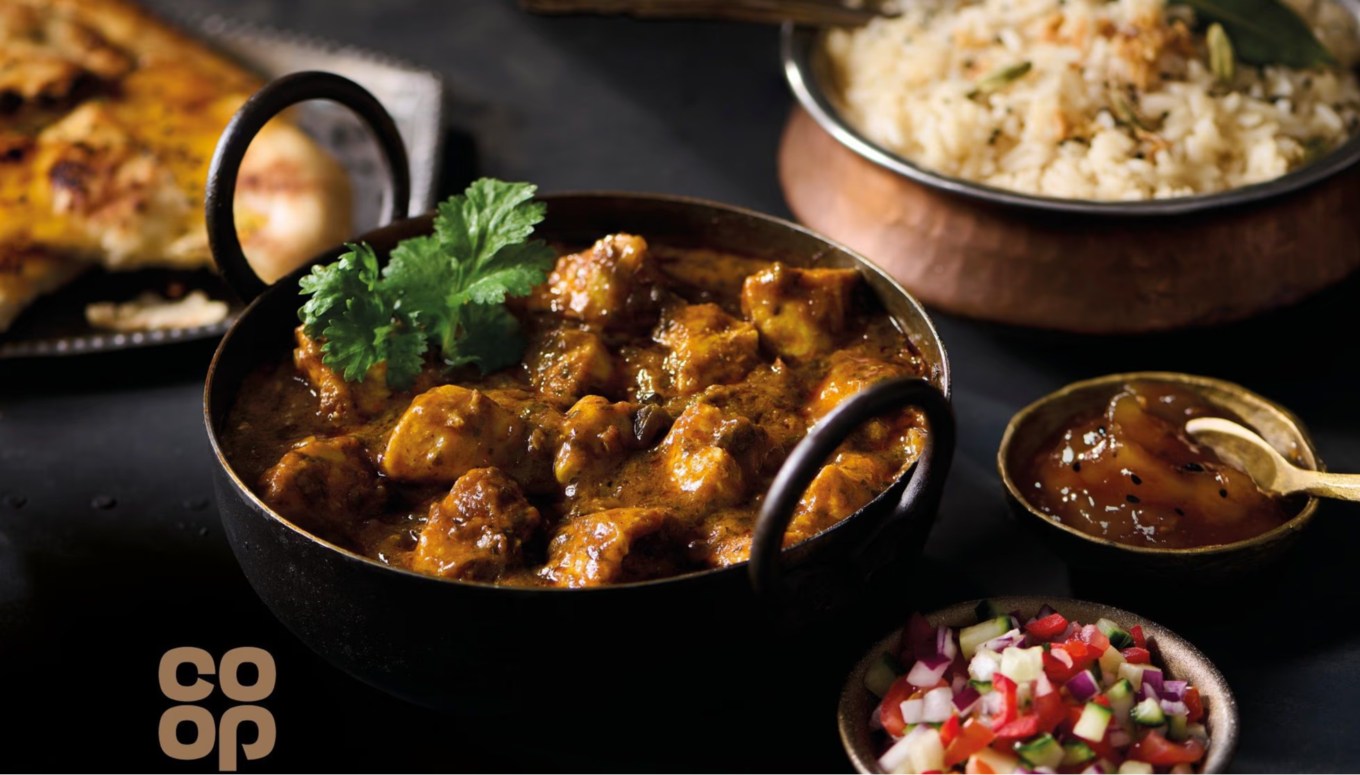
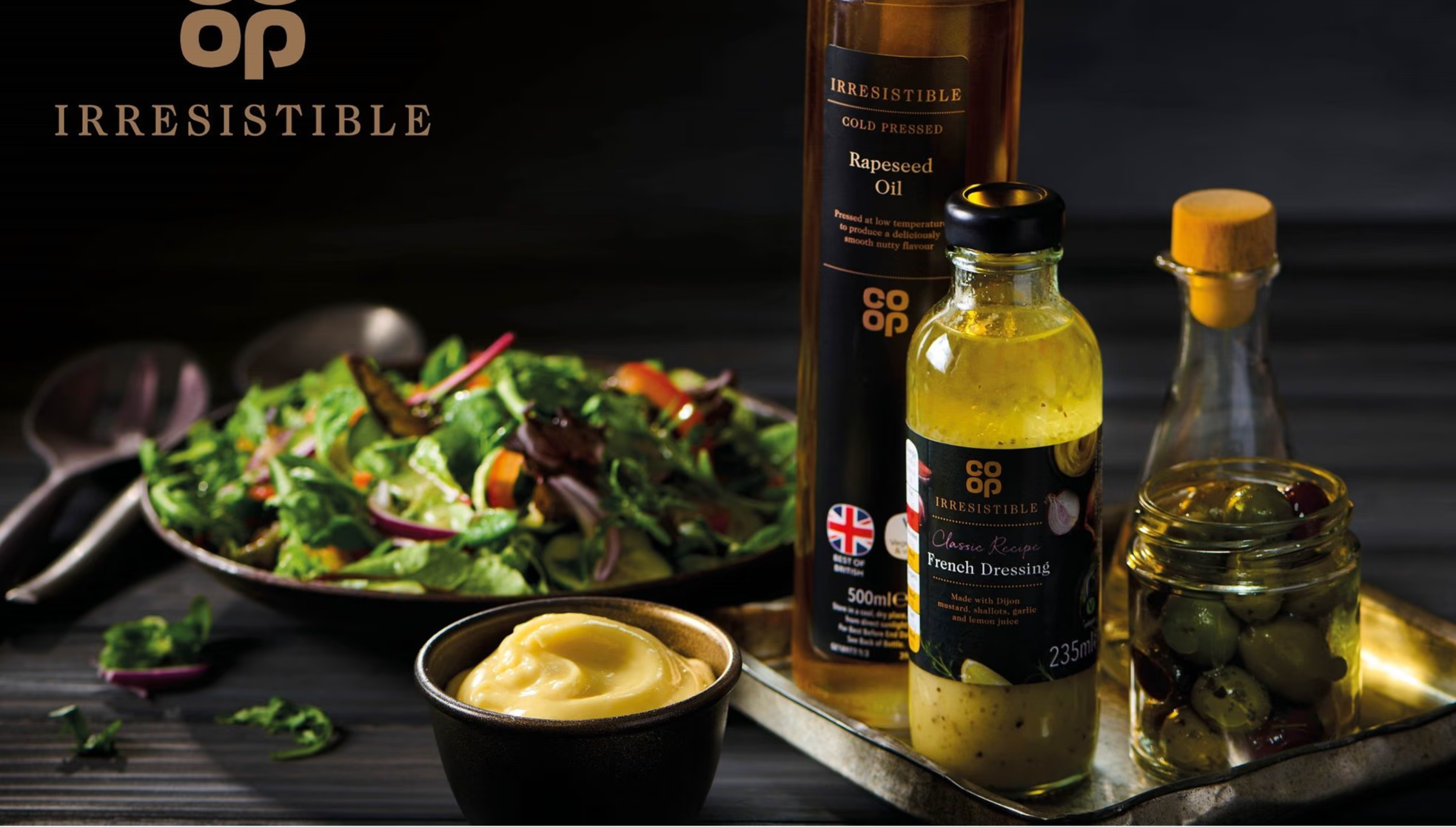
We got straight to the heart of what makes each product ‘Irresistible’ – and treated each category separately. Previous guidelines had been quite single minded and ridged. Not ideal for a range of 500+ lines. Who wants their pizza packaging to look like their chocolate packaging?
Real connection
We dived into customer insight and occasions, using stories to bring products to life, and design to inject character and give it the stature it deserves.
We proposed locking up the word Irresistible with the main Co-op logo to build on recall and recognition of the brand. We then relaunched the entire Irresistible range of packaging with a whole new approach to photography, with designs that tell a story – and celebrate occasion.
Real results
- 8% uplift
- in Irresistible chocolate sales alone since redesign
Share
What’s more irresistible than Irresistible?
When we were asked to evolve a successful brand with 500 plus products already performing well, we used insight and stories to raise the game and create a new packaging design.
Business Objectives
Disciplines
Sector
Users who viewed this work also looked at: